Written By: Sonia Kaila & Maya S
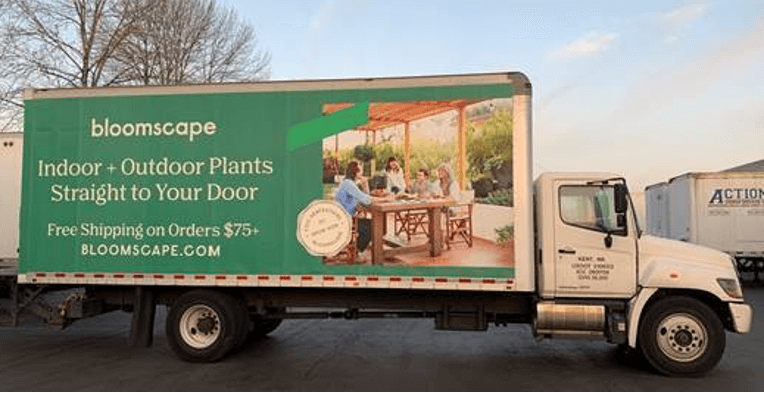
The general rule of thumb we like to follow when developing creative and engaging ads is that less is always more when it comes to text and images. The message you are trying to send with your billboard should be kept clear, concise and memorable. This is mostly due to the short attention span that consumers have, especially in today’s age where social media is constant and the internet is quick. Your mobile billboard needs to stand out with bold and crisp designs that grab the attention of a viewer and stay at the forefront of their minds.
These types of billboards already attract more attention than static billboards, which tend to fade into the background. Thanks to this advantage, your ad will probably be noticed by at least a few people so the key aspect of your ad should be that it’s memorable. This means that it is more important to make sure that you command that extra attention through compelling graphics and messaging. We know that this isn’t always the easiest part of creating a mobile ad, however it is the most important part. In order to make this process easier for you, we have put together a clear, information packed guide to everything you need to know to make your truck ads pop!
1. The Billboard
Design creatives can go a long way when it comes to creating and producing an ad that is visually appealing and eye catching. There are many ways to create a billboard that will leave a lasting impression, such as the following;
3D Billboard
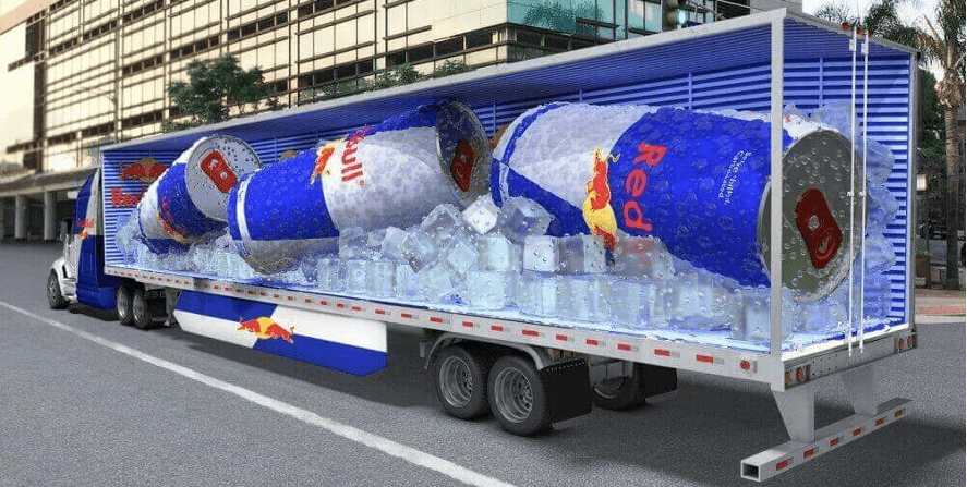
Using 3D billboards on trucks is a great option because it has that wow factor you are looking for and combats the limitations of a stationary 3D billboard. By choosing an image and then covering all sides of the trailer with different angles of it, the ad now has much more depth, giving it a much more realistic view. From the sides, it may look like any other standard billboard, but when the truck is moving and passing other vehicles, the full effect of the 3D illusion takes place. This message can easily be seen from afar, as well as up-close.
Use a Screen on your Truck
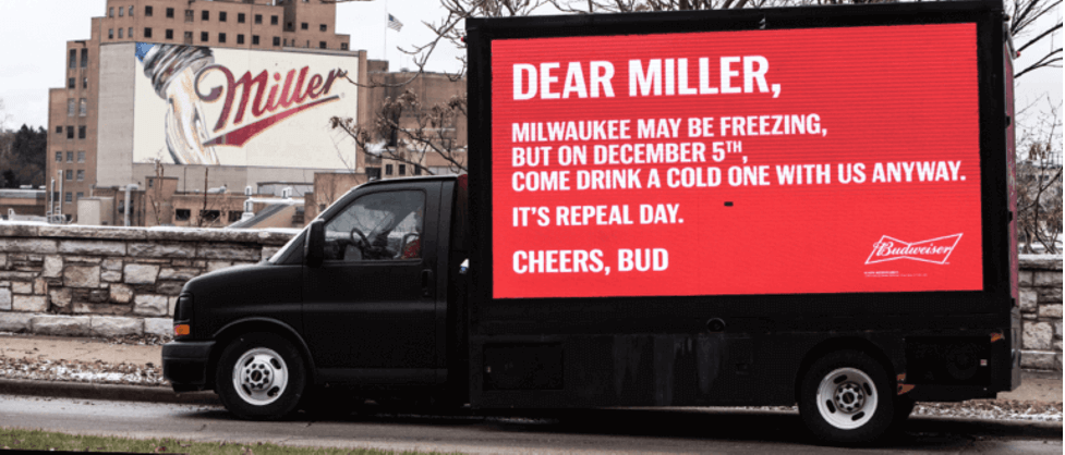
A large LED screen can be put up on the side of a truck rather than using printed vinyl wrapping. This gives the ad the advantages of both digital and mobile Out-Of-Home advertising. This type of campaign also benefits from the bright and vibrant screen that can illustrate not just images, but a GIF-like billboard or even a short ad video.
Glass Trailers
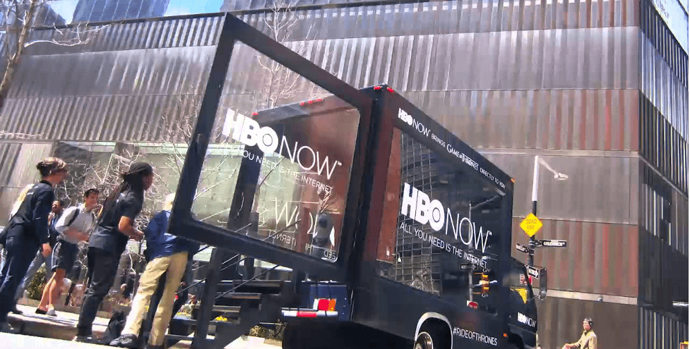
The truck’s trailer can be replaced with glass walls and the inside can be designed to fit whatever is needed for the purpose of the campaign. If you wanted to use this type of advertising, it would need to involve a more engaging and on-the-go experience. These can range from being a mobile store display, an interactive space for the public, or perhaps even a small concert. There are endless possibilities for this option based on how creative you are.
Product Replica
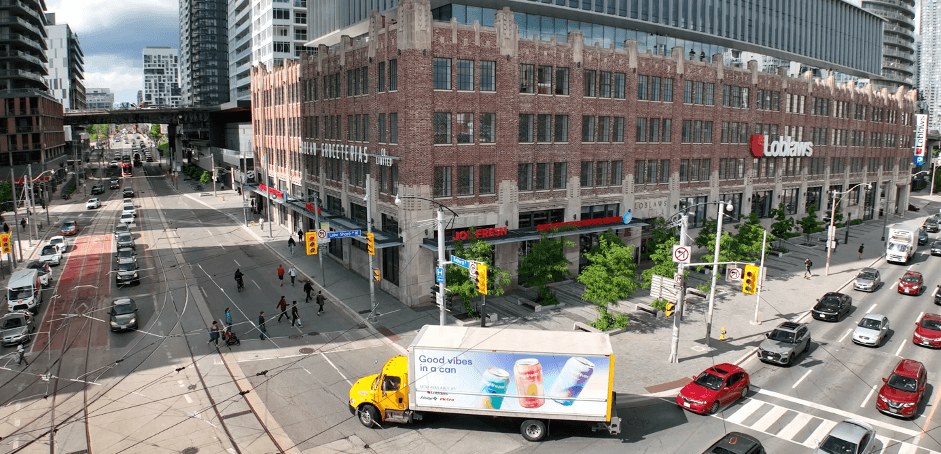
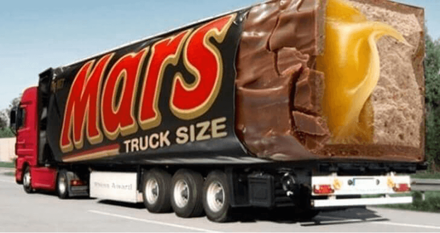
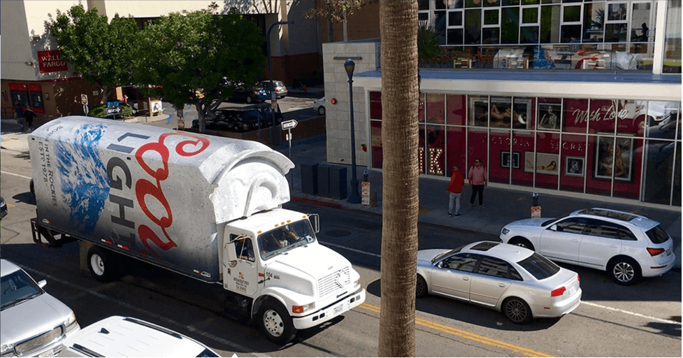
Don’t be afraid to reinvent the trailer completely! If the ad campaign is for a product, then there is always the idea of building a giant replica of that product and placing it on the truck where the trailer would be. This idea can be combined with the glass trailer to give the audience a clear view of the product.
2. The Image
Designing an engaging mobile billboard is easier said than done. You need to consider factors such as proper branding and images. At the same time, you want your advertisement to be visually stimulating and memorable because the images are the most important part. Here’s what you need to keep in mind when looking at the image of your billboard!
Brand Identity
One of the great uses of mobile billboards is to spread brand awareness. It’s crucial to make sure that your branding is solid and translates onto your ad in order to spread the word about your company and product. Eventually, this will allow for people to automatically associate either a logo, slogan or a specific colour palette with your brand.
Consistent Imagery
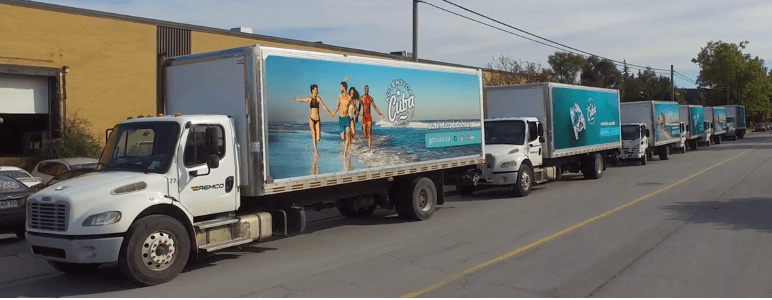
It’s important to make sure that your ad image is consistent with your product and company’s images. You wouldn’t want someone to see an image from your truck ad and not associate it with your product by being too different. This is essential if you have a logo or a signature look/product for your company. You can keep this consistency either by incorporating logos, colours or even layouts. For example, when Starbucks unveils their new holiday drinks, you usually know it’s Starbucks thanks to the colours and layout of the ad.

Bright Colours to Make it Pop
By using bright colours and fun fonts/text, those who see the billboard will be more likely to notice your advertisement. Using bright colours, bold texts, and visually stimulating graphics or photographs are the building blocks of any effective mobile billboard. Remember, “making it pop” does not mean tacky or overdone so keep it simple, but noticeable.

Engage or Entertain
The best advertisements we see are typically those that we find the most entertaining or engaging. When you use content that is funny or has a shock factor, people are more likely to take notice and not only remember the ad but also share the sighting with friends or family. There are many innovative ways to engage and entertain a mobile billboard viewer in a way that makes sure they remember you, so always consider what makes your brand and product engaging!
Use Persuasive Images
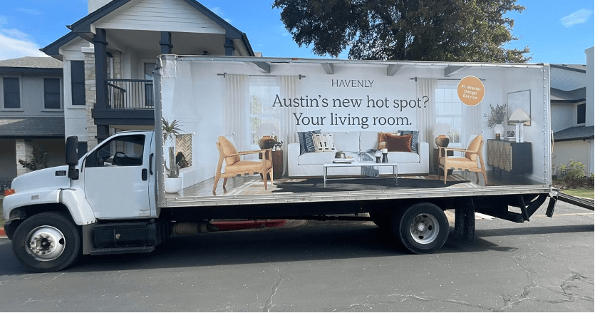
Images speak louder than words. This is why you have to use visually appealing yet persuasive imagery to get your message across. Ensure the image you’re using in your design is relevant to your goal. Some people may not even have the patience to read the lettering. However, with the image synchronized with the message, a quick glance at the image will convey the right message. A lot of business owners make the mistake of choosing images that are too generic or boring for the eyes of the public. They don’t realize that this small mistake is costing them loss of attention and customers. The most effective practice when it comes to choosing persuasive imagery is to choose an image that resonates with your brand identity. This will enable you to deliver the message of your business effectively.
3. The Message
Although the images are the most prominent part of the mobile ad, let’s not forget about the messaging as well. You might not always have messaging in your ad but when you do there are 3 key things to consider;
A Message is not Always in Words
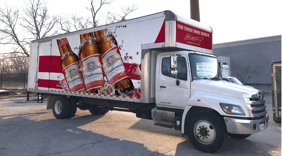
Sending a message has two meanings – either through words or through the meaning behind the image or text. Since words aren’t always necessary, we want to make sure that before we say what we want through text, we try to say it through images. This means that you should use the image to send your message and then only use text as back up. For example, having an image of your product in action and then text that says call for more information is sufficient if your goal is to generate leads.
Avoid Wordiness in the Copy
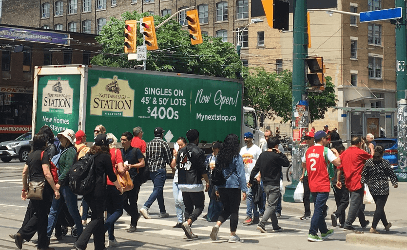
There are times where copy is needed and times when it is not. Sometimes just a striking image can carry a 100 word message and that’s all you need. Although, other times, particularly for smaller companies, including copy can help consumers understand your brand and ad. These can be things like slogans, addresses, phone numbers or a call to action. Whatever you choose to say, always keep this copy short, subtle and purposeful since they won’t be looking at it for long – make a statement with your statement!
Call-to-Action
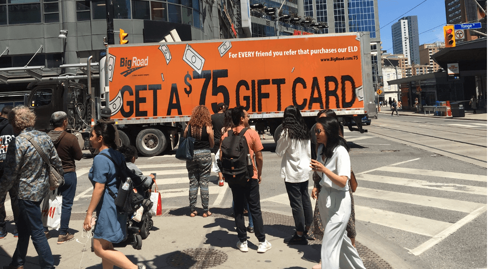
If the goal of your ad is to invite consumers to complete a follow up action then it would be best to ensure your ad has some kind of Call-to-Action (CTA). This CTA should be visible, easy to remember and easy to understand. These can be things such as calling you for an estimate or inviting people to come to the store to shop a sale.
4. The Tips and Tricks
Now that you have a basic idea of how to design a truck ad, here are some extra tips and tricks to really make sure your mobile billboard is the best on the street!
Mockups are Important
Mockups are extremely useful when it comes to creating designs. Don’t be afraid to make an initial one for your designer or ask to see a couple different outlines of your idea to ensure that you both are on the same page right from the start. This will help you have peace of mind and discuss what direction you want the graphics to go. Additionally, this will also help your designer understand your vision so you can have a more harmonious relationship.
Simplicity
Simple is always better when it comes to mobile billboard ads. The more straightforward and direct your ad and its message is, the better the consumers will understand it in the brief amount of time they have to see it. It’s tempting to put as much information as possible on an ad so people can have as much of this information as possible, but keep in mind this isn’t always the right course of action. As we said before, people will only see your ad for a brief amount of time. This requires you to make sure that only key information is included in the copy, like phone numbers or taglines, if it’s necessary. If too much information is included it’s likely they’ll get lost in it and forget about the ad and your company entirely.
An easy way to make sure people can really take in your ad in its entirety is to give your ad 5 seconds. If you can’t understand your ad in 5 seconds, then chances are high that there are many other people who won’t either. Keep reworking that ad design until you can be sure that it both communicates the message you want to send and consumers can understand it in 5 seconds or even less.
Make it Specific
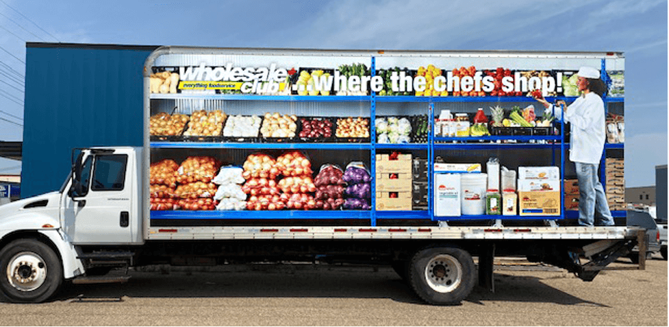
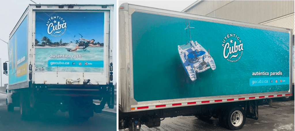
Making your mobile billboard as specific to your audience as possible is also key to a high quality ad. For example, if your billboard is set to have a route in a certain location, then it may be wise to target that location specifically through incorporating sayings or images of people that the residents will recognize, or even translate the ad into their language. This shows any potential clients that you already understand them and would help you stand out from other mobile billboards. This could also be a great option to include in your ads if you plan to put them in multiple cities so that you can make the citizens feel like the ad relates to them.
Last but Not Least!
As a business owner in a highly competitive business environment, you need to design mobile advertisements that make your business stand out from the crowd. One of the most effective ways for you to do this is through out-of-home (OOH) advertising.
However, for your OOH ads to be effective and catch your customers’ attention, they need to be unique and creative. Creative mobile billboard ads always turn heads. The above guide forms part of the basic knowledge you need to design a highly impactful mobile billboard advertisement. If you put out a design with a clear message in mind and make your message simple while using compelling images, you’ll have a visually appealing design that’s effective at the same time.
If you would like to learn more, contact us and we would be more than happy to help you through the process!


