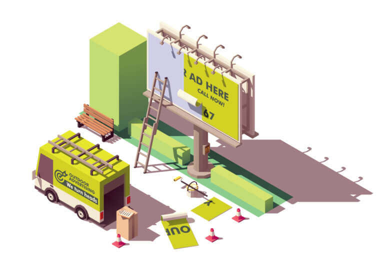
As a business owner in a highly competitive business environment, you need to develop a strategy that makes your business stand out from the crowd. One of the most effective ways for you to do this is through out-of-home (OOH) advertising.
In simple terms, OOH advertising is the act and art of displaying and creating massive awareness of your brand in people’s minds using large canvas billboards. However, for your OOH ads to be effective and catch your customers’ attention, it has to be unique and creative. Read on to find helpful tips for designing head-turning OOH ads.

1. Design With A Clear Message
One of the main aims of engaging in OOH ads is to pass your message out boldly and clearly. The first thing you have to do then is to determine what your message is. What exactly do you want people to see and retain in their memory? Is it your products, your brand, or your website? Identify your message and display it boldly.
If it’s the products you want to show, your graphic design must do an excellent job of emphasizing your products and making them stand out. If it’s brand awareness, you have to be sure everything that represents your brand is on that design. You must have your logo and brand colors. And if you have a company motto, it should be well displayed, too. In a situation where you want the website to become noticed, make sure the website is well and boldly written.
You can’t put all your messages together at once in a design. It’d make the design look cumbersome and cluttered. And for readers who have approximately less than 60 seconds to read and move on, they might not really get what you’re trying to say. So identify your message and display it boldly.
2. Make Your Message Legible
This point is closely related to the first tip and similarly important. After identifying what you want to convey to people, make sure your underlying message is very legible. No one wants to keep figuring out what you intend to send to people. If your message is not clear or readable, you’re not passing out any message at all.
OOH ads are cool for onsite companies, but even online companies also engage in the use of OOH ads. And it converts as long as the message is legible. Online fax companies can help you make the best OOH ads. This is why your copy or underwriting has to be brief, direct, and in clear, simple language.
3. Use Bright And Contrasting Colors And Font
One of the things that can either make or mar your design is the choice of colors and font you use. Choosing the right color blends and fonts could give you highly creative work with a stunning design. Make sure when picking your colors, choose bold and bright colors that will easily announce themselves.
Also, choose contrasting colors for your design. You can improve the legibility of your message by using contrasting colors that go well together. For instance, you can use a mixture of yellow and blue colors, red and black, black and white, pink and purple, and so on. These bright and contrasting colors will easily display your design even in a long range.
4. Simplicity Is The Best
Whatever your design is, it’s best to keep it simple, just like your message. Since your design expresses your message, keeping it simple will make sure your message is clear. You don’t want a complex OOH ad design that everyone’s trying to understand but can’t. You don’t need a design that’s shouting your message in high pitch, so it’s best to go for a simple, creative design.
5. Use Persuasive Images
Images could speak louder than words. This is why you have to use beautiful yet persuasive imagery in passing your message across. Ensure the image you’re using in your design is speaking the heart of the matter, that is, addressing your goal. Some people may not even have the patience to read the letterings in your ads. But with the image boldly synchronizing with the message, just a glance at the image passes the right message across. A lot of business owners make the mistake of choosing images that are way too generic or boring the eye of the public, not realizing that this small mistake is costing them loss of attention and customers. The best practice when it comes to choosing persuasive imagery is to choose an image that best resonates with the brand of your company, as well as delivers the message of your brand effectively.

6. Use Mobile Billboards
This is the latest and maybe the coolest OOH ad. The big truck side is converted into an attractive mobile billboard. This means your OOH design doesn’t have to be in one spot. It moves around your prospective customers. What’s more, since the designs are huge and at the side of the truck, they’re at eyes’ length. This means people are going to see the ads even if they don’t plan to.
7. Increase Your OOH Ads As Well As Their Impact
If you have your OOH ads in just one location, that’s great. People in that location or passing through that area would be able to see your advertisement. But if you have it in more than one location, you’re doing two things:
- Creating a wider space for awareness and introducing your brand to a larger scope of people: This means more people in different locations would become aware of your brand.
- Reestablishing and concretizing your brand’s presence in the minds of people seeing it: Those who saw your OOH ad in a location before may not have paid much attention to it. But seeing the same ad in another location would register the brand in their minds more, and they’d get to see the little details they might have missed the first time.
So if you have your OOH ads in about five to six locations, you’re increasing your visibility and registering your brand in the minds of your prospective customers. However, it’s important that the design in all your locations is consistent. Make sure it has the same message, the same color mixture, the same logo, and so on. This isn’t only cool and good for aesthetics, but it also promises a greater yield for your ads.
Conclusion
Head-turning OOH ads are always creative pieces. The above tips form part of the basic knowledge you need to design a great one. If you put out a design with a clear message in mind and make your message simple while using compelling images, you’ll have a great design that’s effective at the same time.


