Billboards have been around for a long time, and they are far from disappearing. Creative outdoor advertising is timeless because it costs the viewer nothing to digest. However, this is only true if careful time and consideration are factored into the advertisement that is visible to the consumer, based on the location. Meanwhile, other forms of advertisements, such as commercials, impede on a viewer’s experience of content they are trying to access which sacrifices their time and becomes an annoyance.
Outdoor advertising can be seen as beautifying a space while informing audiences about a service, or it can be considered visual pollution. To prevent the latter, planning should encapsulate a variety of factors such as location, target audience, and visibility. Just as there is a strategy to occupy indoor spaces with quality ads, there is a way to incorporate billboards in a landscape so they don’t feel like an unnecessary, manmade creation. Let us talk about how billboards work to provide great advertising in an outdoor landscape.
Creating Brand Awareness
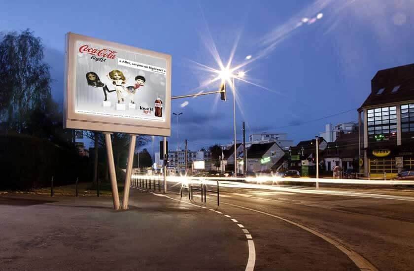
Informing your audience is an intuitive way to get their attention so that they feel they have learned something valuable that will lead them to focus on your product/service. In this day and age, less is more. Too much information on a billboard is unnecessary as everyone has access to a wealth of knowledge on the internet. A simple call-to-action by means of phone number, under the main message, is enough to include on a billboard ad to get consumers introduced to your service and make the call. It’s vital to ensure that there is enough information for the viewer to understand what your brand represents and provides so that they can look it up later on. However, too much information can lead a consumer away from your brand and onto the next billboard because they simply don’t have the time to read that much when on-the-go.
If you’re looking to do an outdoor ad, whether as an agency or as a business owner, remember that it cannot do the heavy lifting. The outdoor ad can’t speak for everything that the company stands for, but it can be simplified to get across the right amount of messaging. Once you start putting more than ten words of copy on a billboard, people will find your ad cluttered and drawn out which leads to it being a waste of money. You have to choose wisely while taking into account that digital advertising can be paired with the outdoor message.
Making an Impression
Bold and visually appealing graphics are an essential aspect of outdoor advertising which is emphasized by the sheer size of a billboard. Still, technology is evolving and an ordinary billboard is no longer as impressive as it was thirty years ago. Location is an essential element of outdoor advertising because it will determine the lifespan of the billboard’s physical expression.
For example, someone who listens to music on public transit, with their head up and off their phones, will be attracted to anything remotely interesting. The job of a billboard, in this case, is to grab the attention of this possible consumer and get its message across in the brief moment it takes for the passenger to notice the sign and read it within a few seconds. Because they’re already being half consumed by some media, the billboard must be particularly fascinating enough to reach the avid listener. To leave a lasting impression, the billboard text should be concise in its intention and easy to understand.
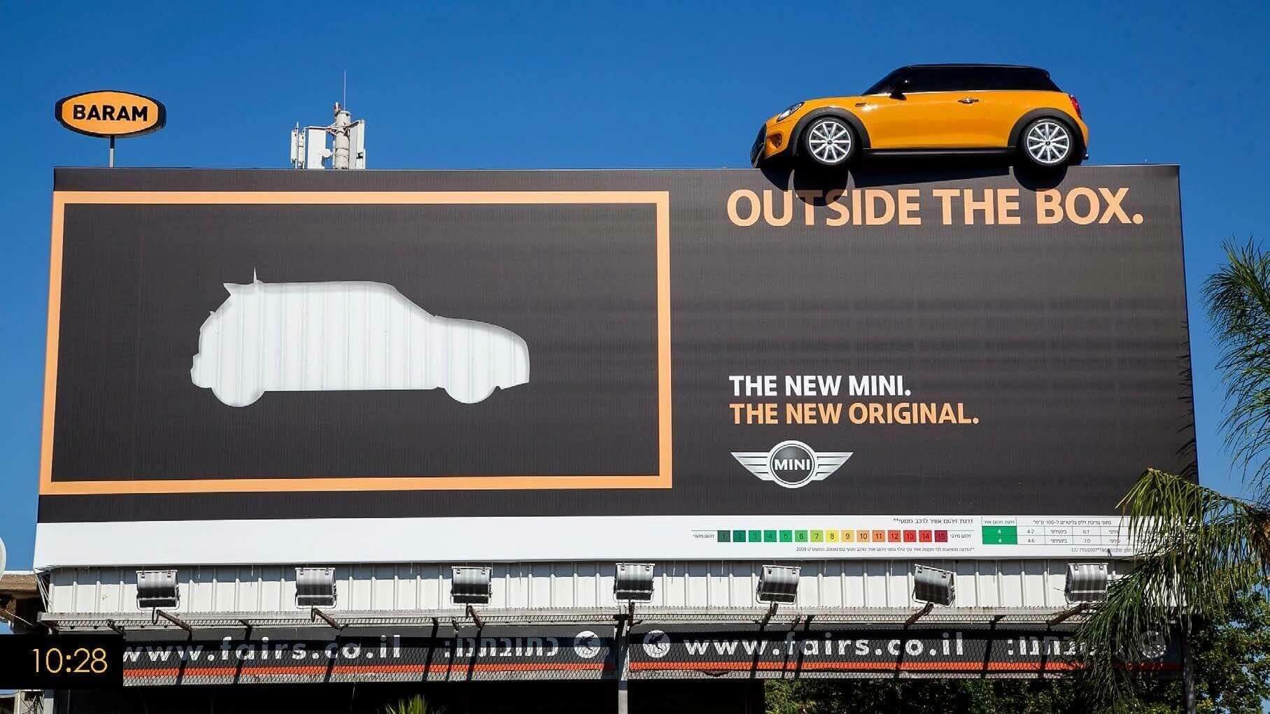
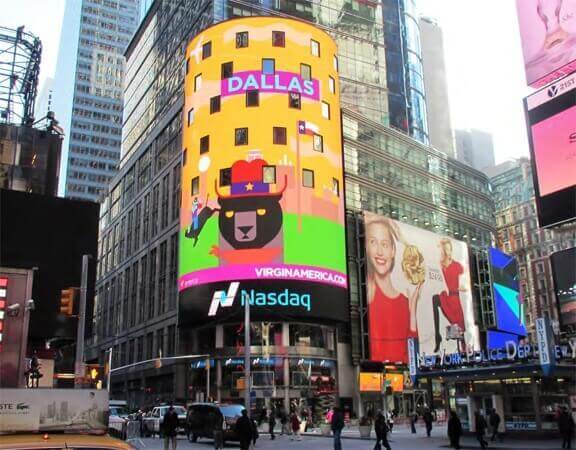
Being memorable and concise is an obvious answer to make a billboard work in the minds of consumers, but what exactly does that mean? A method to stimulate interest in a viewer is to use technology to its full potential. Using animation, 3D design, LED display, or an interactive interface to capture attention is a great way to generate interest, and it will get viewers to share the advertisement with others, allowing it to spread far beyond people’s first hand experience with it. Social media will take on a role in your advertising campaign and will gain traction as it grows.
Billboard advertisements may be seen as a hindrance to viewers, and an overly clustered display of spending dollars. However, done beautifully, a billboard can work the same way as a well thought out social media narrative that a company has executed. A strong billboard can have the same artistic impact as a temporary architectural display at a local gallery.
Creative outdoor advertising is often overlooked as an art form because it’s seen as commercial and for the sole purpose of adhering to capitalism. However, what makes billboards work better than digital forms of advertising is that they’re tangible pieces that consumers can interact with in the outside world. They’re physical commodities that people can experience. An online presence is important, absolutely, but the gift of billboards is physical stature, strengthening the brand’s place is an environment touched by ads.
The Role of Billboards
Billboards play a massive role in beautifying the city and, as effortless as they may seem, it takes an immense amount of time to integrate them so they blend seamlessly with their surroundings while staying true to their intentions. The best way to make sure that your advertising is noticed is to make sure that you’re inventive about how you present your brand to the public.
A big, blank canvas billboard advertisement in a black or dark grey tone won’t evoke the same response in people as a colorful, exciting billboard. At the same time, it depends on the service you’re trying to promote. A funeral home may find that a dismal billboard will work for them to set the tone of their company, but the copy should be mighty when the visual isn’t. If the billboard model looks right, it will capture everyone’s attention.
One of the most significant limitations of billboards is the time available to impact the buyer. Therefore, the ads should only consist of a clear, understandable and, if possible, surprising image so that the audience can catch it at a glance. The phrases must contain short messages, easy to read, understandable, and allusive to the promoted product. Colour choice is a great tool that makes your message stand out; a good recommendation is to create a color harmony that highlights the words. Also, play with the tones and textures of the composition. With some creativity in mind, it can be used to leverage the audience’s response to it.


