By Sam Marasigan and Rose Sugatan
Introduction:
In today’s digital age where consumers rely heavily on online platforms for their daily needs and entertainment, traditional advertising channels such as outdoor marketing might seem less effective. Yet this is not always accurate–mobile billboards with well-crafted designs can still make an impact in capturing audience attention and driving desired behaviors efficiently. By following fundamental design principles and understanding what messaging and visuals work best, these mobile billboards can serve as an integral part of any successful modern day marketing campaign.
Simplicity and Clarity:
When designing mobile billboards for truck advertising, it’s crucial to keep in mind that you only have a few seconds to make an impact on viewers. Therefore, simplicity and clarity are vital to ensure your message is effectively communicated. Mobile billboards do not have to rely on designs that are too complicated in an attempt to stand out, to the point that the message becomes muddled.
To create a compelling mobile billboard design, avoid cluttering it with excessive information or overdone visuals. Instead, focus on a clear and concise message that instantly captures attention. By stripping away unnecessary elements, you can enhance the readability of your design and help viewers quickly grasp your message.

Image Source: fragrantica.com
A clean and uncluttered design allows the key elements of your mobile billboard, such as your brand or product’s value proposition or even just the brand name and logo, to shine. It enables viewers to easily absorb the information you want to convey and leaves a lasting impression. Remember that mobile billboards are viewed in passing, so it’s essential to make a strong impact in a short amount of time.
Visual Hierarchy and Contrast:
When creating a mobile billboard design, an effective visual hierarchy is crucial. By strategically showing the most important parts of your message, you can be sure that it comes across clearer and more impactful to viewers.
To establish a visual hierarchy, use bold and eye-catching elements that can immediately grab attention. These elements need to effectively communicate the key aspects of your message, seeing to it that they are noticed first by your audience. Consider using larger text, vibrant colors, or dramatic imagery to make these elements stand out.
Contrast also plays a significant role in creating visual interest and guiding the viewer’s attention. You can achieve contrast by taking advantage of differences in colors, sizes, shapes, and textures in your design. For example, using contrasting colors for text, graphics, and background can make your message pop and improve readability. Opting for a white text or image against a vividly colored backdrop can create a captivating visual effect that easily catches the viewer’s eye.

Image Source: nyfta.org
Think about the overall composition of your mobile billboard design and use contrast to draw attention to specific areas or messages. Experiment with different color combinations, font styles, and image placements to create a dynamic and visually appealing design. By using contrast effectively, your mobile billboard will leave a memorable impression on viewers and increase the chances of your message being not just understood, but remembered.
Alignment and Proximity:
In relation to visual hierarchy, another thing of note is the proper organization of the elements in your design. Two fundamental design principles that significantly impact the effectiveness of a mobile billboard are alignment and proximity. These principles play a crucial role in capturing attention, conveying messages clearly, and maximizing the impact of the advertisement.
Alignment, which is the arranging of elements in a cohesive and visually appealing manner, serves as the backbone of a well-designed mobile billboard. The design becomes more visually balanced by aligning elements with tools such as grids, which gives it more orderly and professional touch. A well-aligned composition guides the viewer’s eye smoothly across the billboard, ensuring that key messages and visuals are easily understood and remembered.
Image Source: movia.media
Proximity, on the other hand, deals with the placement and grouping of related elements. By positioning elements such as texts, photos, or logos closely to each other, a designer can form visual connections and highlight relationships. Grouping elements that make sense together allows viewers to quickly grasp the main idea without having to decipher complex visuals or lengthy text. Proximity creates a visual narrative, guiding the viewer’s attention and emphasizing the most critical aspects of the advertisement. This principle helps in simplifying the message on a mobile billboard, making it easier to comprehend, even in fast-paced environments.
Effective Use of White Space Space:
The term white space refers to the empty areas within the design that are left intentionally unoccupied. It is the absence of text, images, or other elements on the billboard. For mobile billboards, a great strategy is to make every inch count due to the limited space available on trucks. There are many reasons why making the most of it is a great design strategy.
White space, primarily, helps enhance visual clarity and legibility. By allowing empty areas around the main content, such as text and graphics, the message becomes easier to read and understand from a distance. White space prevents overcrowding and ensures that the key information appears prominently. Additionally, white space plays a vital role in creating a balanced and organized layout. It provides separation between different elements on the billboard, such as headlines, images, and contact information. This separation allows viewers to process information more effectively and enhances overall readability.
White space does not have to be white–it is simply the negative space that offers breathing room and visual relief to your mobile billboard, which adds a sense of elegance and professionalism to the design. The presence of white space allows the viewer’s eyes to focus on the essential elements, making the billboard visually appealing and engaging.

Source: movia.media
Use white space to help draw attention to specific elements of the billboard. The empty areas will create visual hierarchy and guide the viewer’s gaze towards the most important information or calls to action. White space will act as a visual cue, highlighting key messages and increasing their impact.
The thoughtful inclusion of white space allows the most important parts of your design to stand out. It enhances visual clarity, improves readability, and creates a balanced visual. By giving prominence to the message, guiding attention, and ensuring impact, white space plays a pivotal role in creating effective and engaging advertisements.
Harnessing the Power of Color
When it comes to truck advertising, selecting the right color scheme can truly impact the effectiveness of your mobile billboard. Colors play a crucial role in grabbing attention, creating contrast, and effectively conveying your message to viewers on the road. Let’s explore how you can leverage color in your truck advertising design.
It’s important to align your color scheme with your brand identity. Incorporate your brand colors into the design to maintain consistency and reinforce brand recognition. This helps establish a visual connection between your mobile billboard and other marketing materials, creating a cohesive brand image.
In addition to brand alignment, use colors thoughtfully to grab attention and create contrast. The nature of truck advertising allows you to take advantage of the large canvas to make a bold statement. Opt for bright, vibrant colors that stand out and catch the eye of passersby. These attention-grabbing colors can help your mobile billboard command attention amidst the busy streets and highways.

Image Source: roaminghunger.com
Creating contrast is vital to ensure that your message is easily readable and stands out. Contrast helps separate different elements within your design, making them more distinct and understandable. Consider using contrasting colors for your text and background to enhance legibility. For example, pairing a dark text color with a light background or vice versa creates a strong contrast that makes your message stand out, even from a distance.
Drivers and pedestrians have limited time to absorb your message, so it’s essential to ensure that your color choices provide sufficient contrast for easy reading. Avoid using colors that are too similar in hue or value, as this can make the text difficult to decipher. Instead, opt for color combinations that offer enough contrast to make your message clear and instantly recognizable. For instance, using white or light-colored text against a dark background can create a striking contrast that enhances readability, even when viewed from a distance or in various lighting conditions.
Also remember that different colors can evoke different emotions and associations. While it’s important to align your color choices with your brand, also consider the emotions you want to evoke in your target audience. Think about the nature of your product or service and the feelings you want to evoke when selecting colors for your mobile billboard. For instance, if you want to convey trust and reliability, blue might be a suitable color choice. On the other hand, if you aim to create a sense of excitement and energy, red or orange could be more appropriate.
By deliberately selecting a color scheme that aligns with your brand, grabs attention, provides contrast, and ensures readability, you can create a compelling truck advertising design. Colors have the power to capture the attention of drivers and pedestrians, communicate your message effectively, and leave a lasting impression. Make use of the vast space of your mobile billboard to create a visually impactful experience that sticks out on the road.
Visibility and Readability:
When designing a mobile billboard, it’s essential to prioritize readability, especially from a distance. Keep in mind that your target audience will be viewing the billboard while they are on the move, so the design should be easily legible even in a fleeting glance. To achieve this, choose fonts that are clear, bold, and non-serif. These fonts are typically easier to read from a distance. Avoid intricate or decorative fonts that may hinder readability. Opt for larger font sizes that can be easily seen and understood even from a distance.
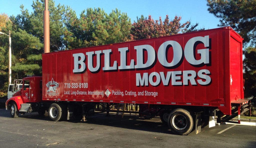
Image Source: bulldogmovers.com
Testing the visibility of your design is crucial. Consider different lighting conditions that your billboard may be exposed to, such as daylight, evening, or night-time lighting. Test the design under these conditions to ensure that it remains clear and readable regardless of the environment.
To evaluate the effectiveness of your mobile billboard design, step back and view it from various distances. Imagine yourself as a passing pedestrian or driver and assess the visibility, readability, and overall impact of the design. Consider how quickly the message can be understood and whether it grabs attention. Based on your assessment, make any necessary adjustments to optimize the design and ensure that it delivers a compelling message even from a distance.
Remember, the goal is to create a design that can effectively communicate your message and capture attention, even when viewed briefly and from a distance. By prioritizing readability and conducting thorough testing and evaluation, you can ensure that your mobile billboard design leaps out and effectively reaches your target audience.
Motion and Animation:
Incorporating motion and animation into your mobile billboard design can be a powerful tool to captivate viewers and make your advertisement stand out. Motion naturally draws attention and creates a dynamic and engaging experience for the audience. When you add animated elements or dynamic visuals to your design, you can create a visually stimulating display and make your campaign even more memorable.
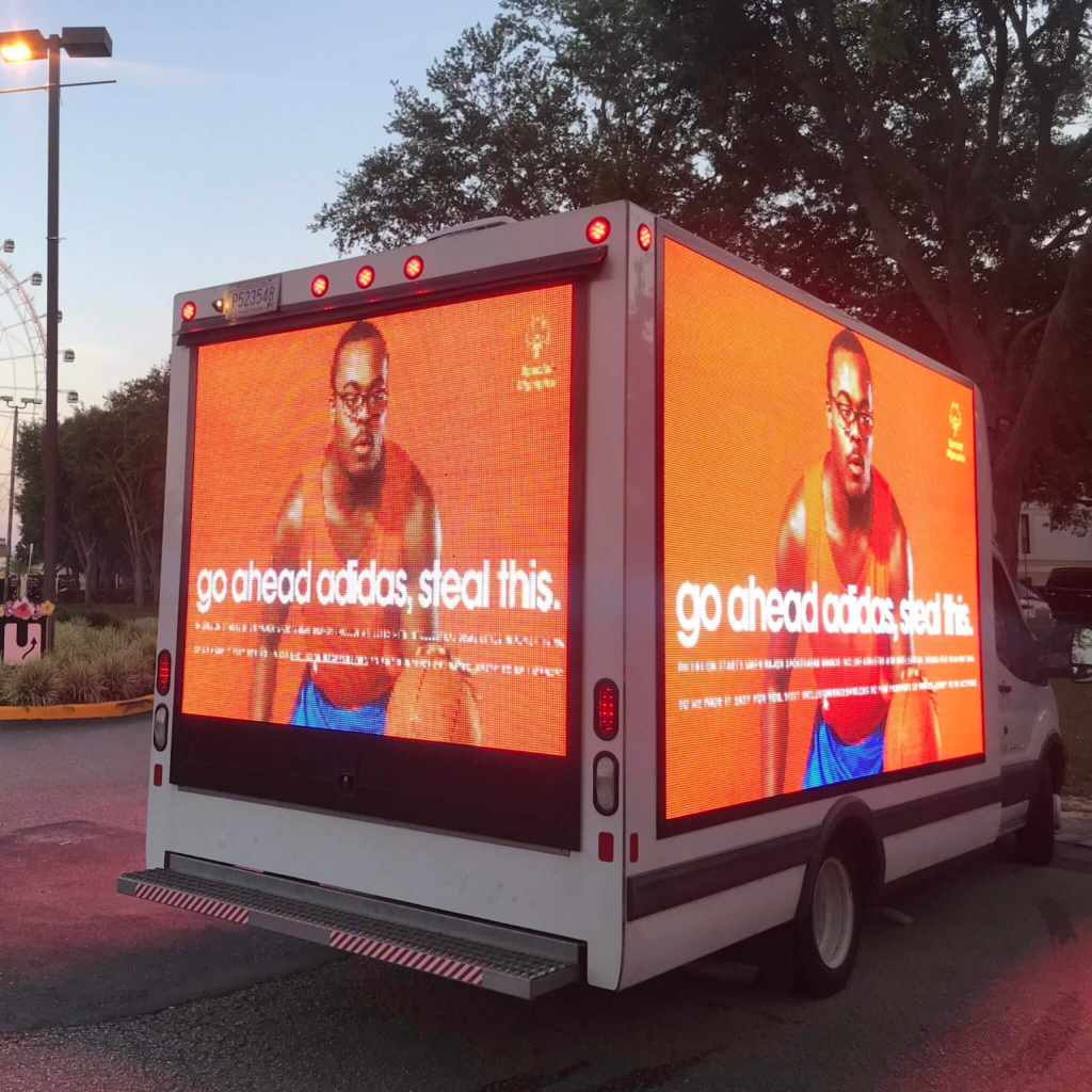
Image Source: movia.media
Using tools such as 3D billboards can add to your brand visibility with vibrant visuals. It is however important to keep in mind the technical considerations and limitations of displaying motion on a mobile billboard. Ensure that the animation is optimized for the specific dimensions and resolution of the display. Test the visibility and legibility of the animated elements under different viewing conditions, including varying distances and lighting conditions. This will help ensure that the moving parts remain clear and impactful, even when viewed from a distance or in different environments.
Remember, the goal is to create a memorable and impactful experience for the viewer. However, it’s also just as vital to exercise restraint and avoid overusing motion or animation. It is tempting to go all out with such a flashy billboard choice, but cluttered or excessively busy design can diminish the effectiveness of your message and make it harder for viewers to absorb and understand the content. Focus on maintaining a clean and visually appealing design that effectively combines motion with the other elements of your mobile billboard.
Static 3D Creative
Static 3D creative refers to the three-dimensional elements in a static mobile billboard design. It involves using techniques such as depth, layering, textures, and embossing to create a sense of visual depth. By strategically applying shadows, perspective, and tactile effects, you can make some elements of your design appear more lifelike and stand out from the background. The use of 3D static creative can grab attention, enhance the visual impact of your mobile billboard, and make it more memorable. However, it’s important to strike a balance between the 3D elements and the overall message to ensure clarity and readability.
Incorporating 3D static creative in your mobile billboard design is a chance to make your advertisement truly stand out. For example, you can use 3D elements to create a realistic representation of your product, allowing viewers to visualize it in a more tangible way. Imagine a mobile billboard for a candy brand that features a visually engaging scene of a three-dimensional pack of candies protruding from the surface, as well as cute, lively characters that represent that brand. This not only captures attention but also gives potential customers a glimpse of what they can expect. By leveraging the power of a 3D static design, you can elevate your mobile billboard to new levels of impact and create a lasting impression in the minds of your audience.
Image Source: linkedin.com
Conclusion:
Designing effective mobile billboards requires careful consideration of various factors, including simplicity and clarity, visual hierarchy and contrast, as well as using white space and colors, visibility and readability, motion and animation. By implementing the outlined design tips, you can create mobile billboards that resonate and leave a lasting impression on your target audience. It is also worth remembering that these rules can be tinkered with, as you continuously test, optimize, and push the creative boundaries to make your mobile billboard campaigns even more effective. Harness the power of well-designed mobile billboards to elevate your advertising efforts and drive meaningful results for your business.