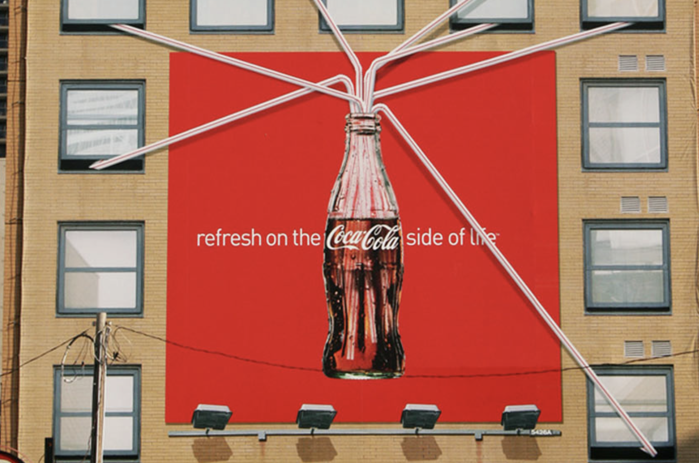
As much as outdoor advertising can be considered one of the best advertising channels, it has to be done the right way to be effective. Yes, there are rules in advertising too. It’s all about right timing and right location. You wouldn’t advertise your outdoor pool in the winter, right? Or winter jackets during summer? It’s not forbidden, but it would just be a waste of money and effort, especially if your audience just discards your ads every time they see them.
The key to outdoor advertising is to be relevant and creative. By any means necessary. People are out in the streets minding their business, so they don’t care about you. It’s your job to make them care. and for that, you need to be noisy enough. Or in this case, visual enough, so here are some tips to brighten your audience’s days and increase your customers list.

Be Creative, The Bold Way
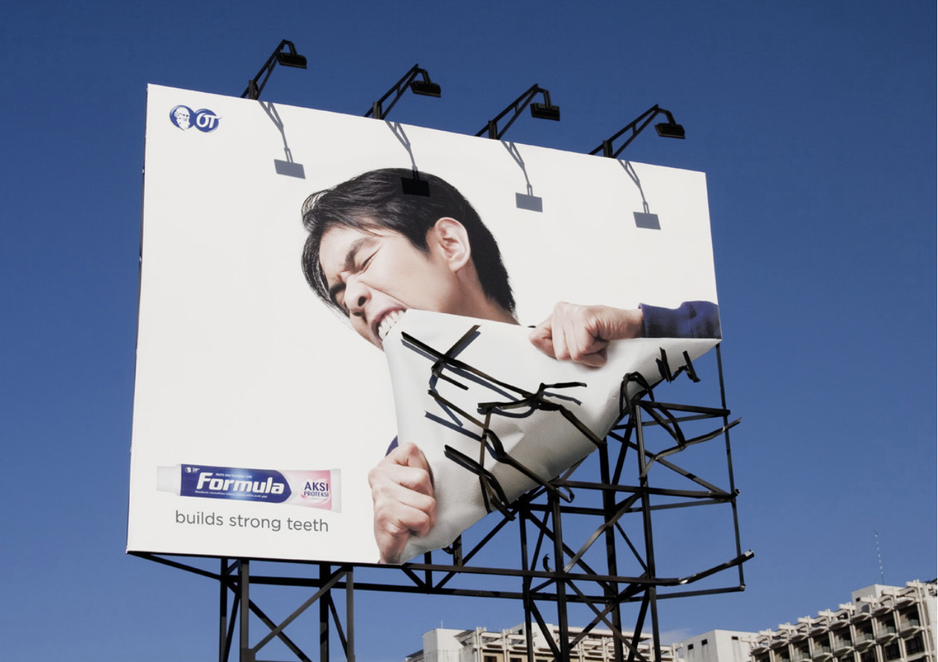
There are days when you feel all gloomy and just don’t want to do anything. Sometimes it’s the weather affecting your mood, sometimes it’s just life doing its thing. Well, your audience goes through this as well. People walking by may need some form of distraction, something to make them smile and get them out of their dark mood while walking down the streets. Same goes for drivers. There is nothing more depressing than being stuck in traffic on a rainy day, when it’s only 6 a.m. And that’s when you come in. If you succeed on impressing your audience by making them laugh or just smile at how over the top your ad is, believe me, they will remember you. A perfect example of exaggeration is this billboard by Ogilvy & Mather Jakarta for Formula Toothpaste. Everyone knows that no toothpaste in the world, no matter how great it is, can make your teeth this strong. But anything is possible in the advertising world, isn’t it?
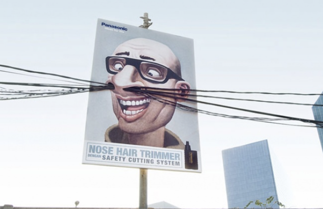
Panasonic on the other hand, used a different kind of humour. Who would have thought that electrical wires could have more than one use? Well Saatchi & Saatchi Indonesia did. To advertise a Panasonic nose hair trimmer, they went as far as to make a bunch of electrical wires go through a billboard, making it look like the man on the poster has very long nose hair. Creativity can make you do anything, if you’re bold enough. Think about all the possibilities and make the most of them while making your ads.
Few Words, Great Impact
Sometimes, the greatest ideas don’t need a paragraph to come across. You just need to use the right words with the right technique. Your copywriter will know what I mean. Let’s say it’s fall, for example. No one is so happy to be outside that they’d spend an hour reading and trying to understand your message, let alone look up your product. Even better than a few words? The right image that goes with it. It all depends on what you think would be the most impactful. Less than six words on a purple background? Or an explosive combination of less than six words on a picture? Consider the following examples.
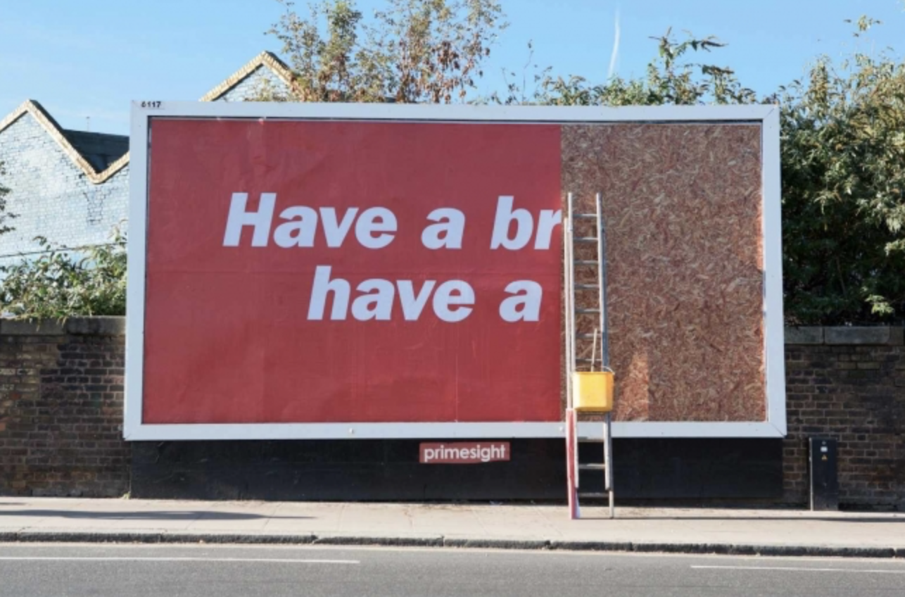
An ad by JWT UK for KitKat took their signature phrase ‘‘Have a Break, have a KitKat ’’ to a whole new level. I mean, what best way to illustrate a break than the billboard being incomplete because the workers had to take a break?
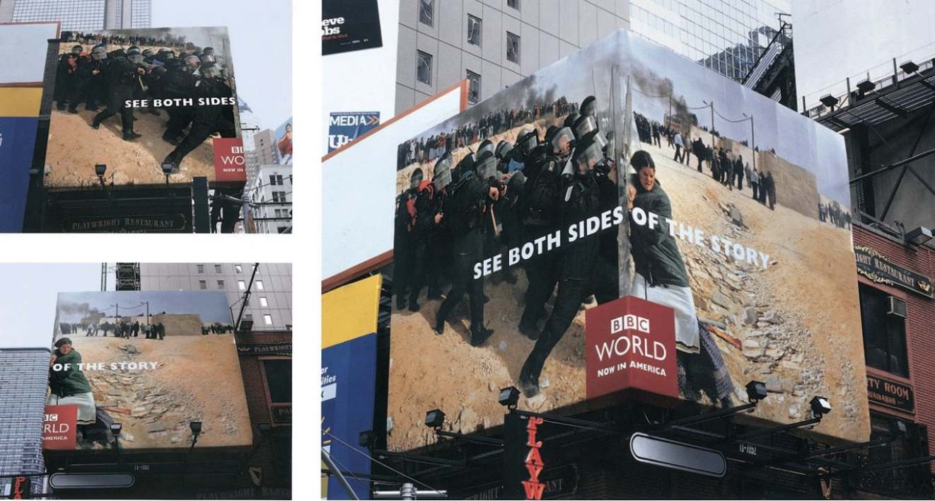
Another clever ad by BBDO New York for BBC World showed a picture on a billboard placed around the corner of a building with the headline “See Both Sides of the Story”. The way it’s designed makes it hard for both the headline and the picture to work alone. They have to be combined to make this incredible ad. See what I mean when I say explosive combination of words and pictures?
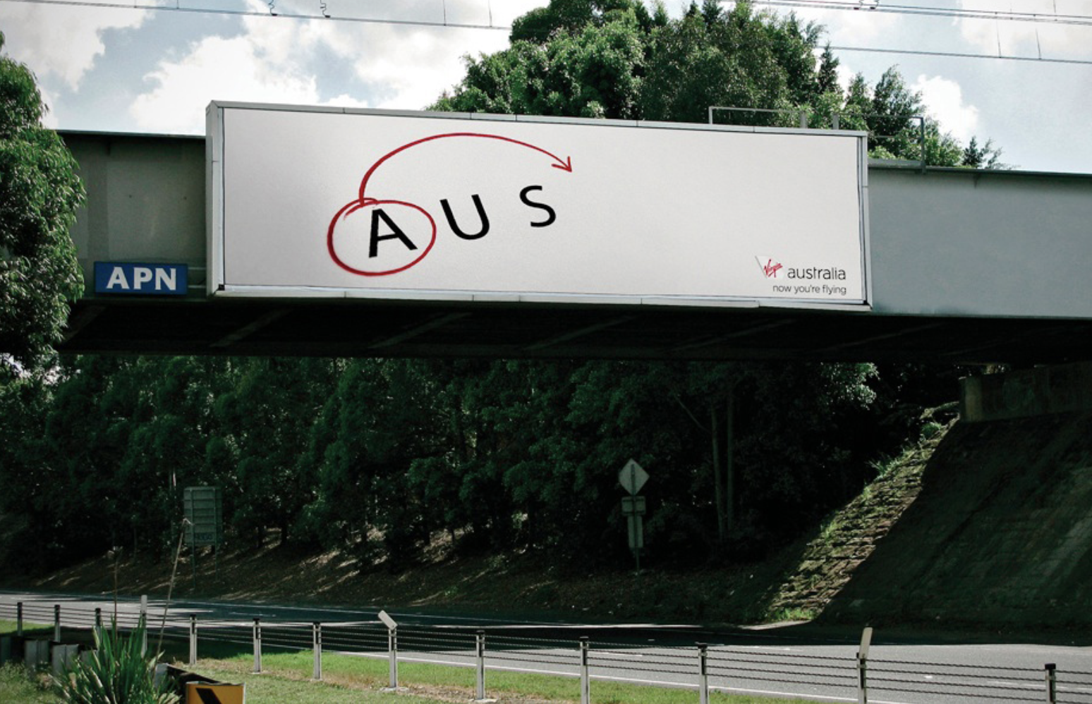
How about few letters, great impact? The agency Clemenger BBDO in Sydney made the simplest and yet most effective ad for Virgin Australia airline.The ad only uses three letters and a symbol to tell the audience that the airline company now flies from Australia to the United States of America. Yes, creativity can be this simple
Pictures Speak Volumes
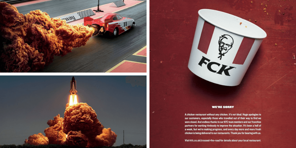
It could be a picture campaign or just you – and when I say you, I mean the agency you hired- using everyday objects as a creative outlet to entertain your audience while informing them about your product. It’s a type of out-of-home called ambient or guerrilla marketing. The KFC Hot & Spicy campaign is perfect example of a great campaign using visuals to get the message across. They used everyday objects that produce flames and replaced the flames with fried chicken and it fit perfectly. It’s also an interesting and unusual visual so it would definitely make anyone smile. The campaign won gold at the Cannes Lions and a wood pencil at D&AD in 2018. There was even an animated version created in celebration of the premiere of Game of Thrones. Now this is how you make it in advertising.
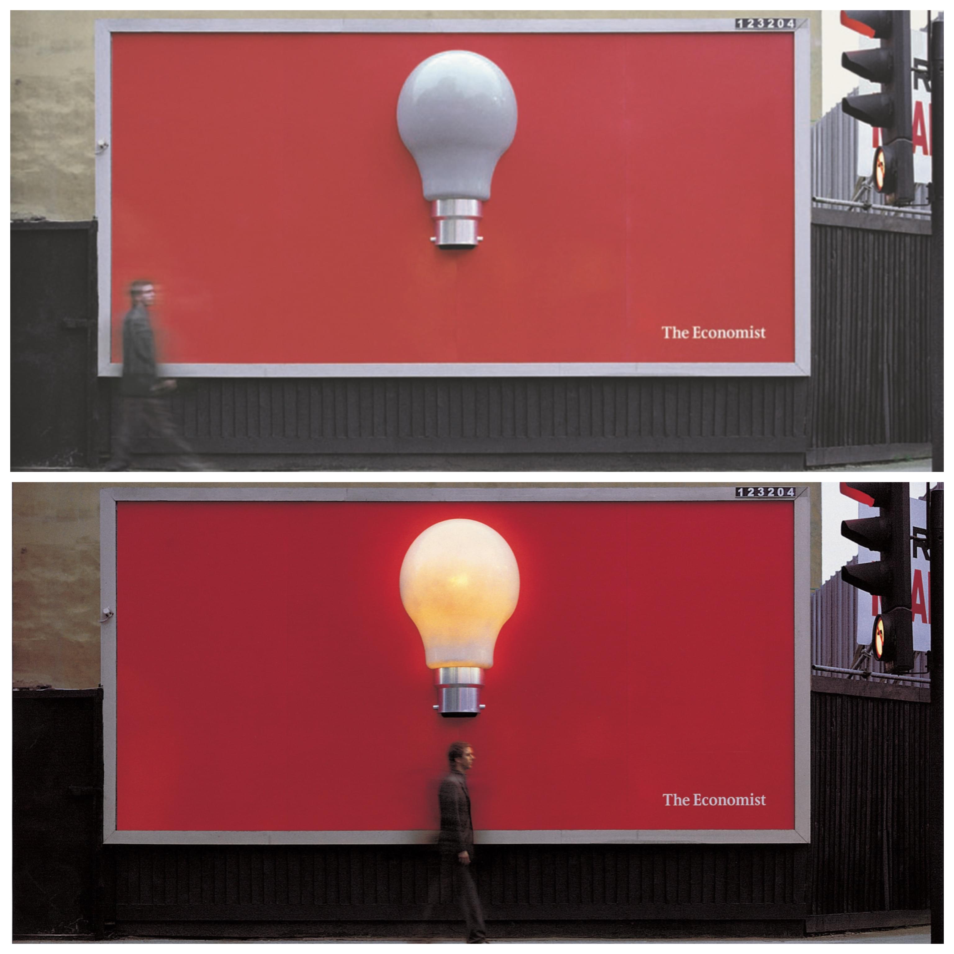
It can also be an illuminating ad. Literally. Remember this ambient made for the Economist in the U.K. by BBDO ? Well, it’s an old campaign so not everyone would remember, but it was very successful and clever. They didn’t use any word at all. It was just a red billboard with a light bulb that turns on when someone walks by, but to the right audience, the message is pretty clear. Reading the economist sparks dialogue and generates ideas. What better way to put it?
Be Appropriate And Topical
Again, it’s fall. Be appropriate about the product advertised or how you advertise it. Think of your audience first, what would make them react? But it’s not all about the season either, it could be the location too. In the fall, we have thanksgiving and a lot of people visit their families at that time of the year. Sure, a lot of them book flight tickets, but what about those on the road? If for example you are in the food business and you want to attract consumers in your restaurants while they are travelling, where would you put your ad? Hint: McDonald. Get it now? Ok, let me explain.
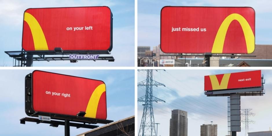
McDonald’s campaign ‘Follow The Arches’ done by Cosette Canada was one of the most influential OOH of 2018 . They started by putting up four billboards, three statics and one digital, with parts of the McDonald’s logo on each. One of the reasons why it was so successful was its creativity, but most importantly, its location. The restaurant was nearby, and the billboards gave the customer simple directions to get there. Also, just the sight of the board could make you hungry so you’d stop at the restaurant for a quick fix. It’s a win win.
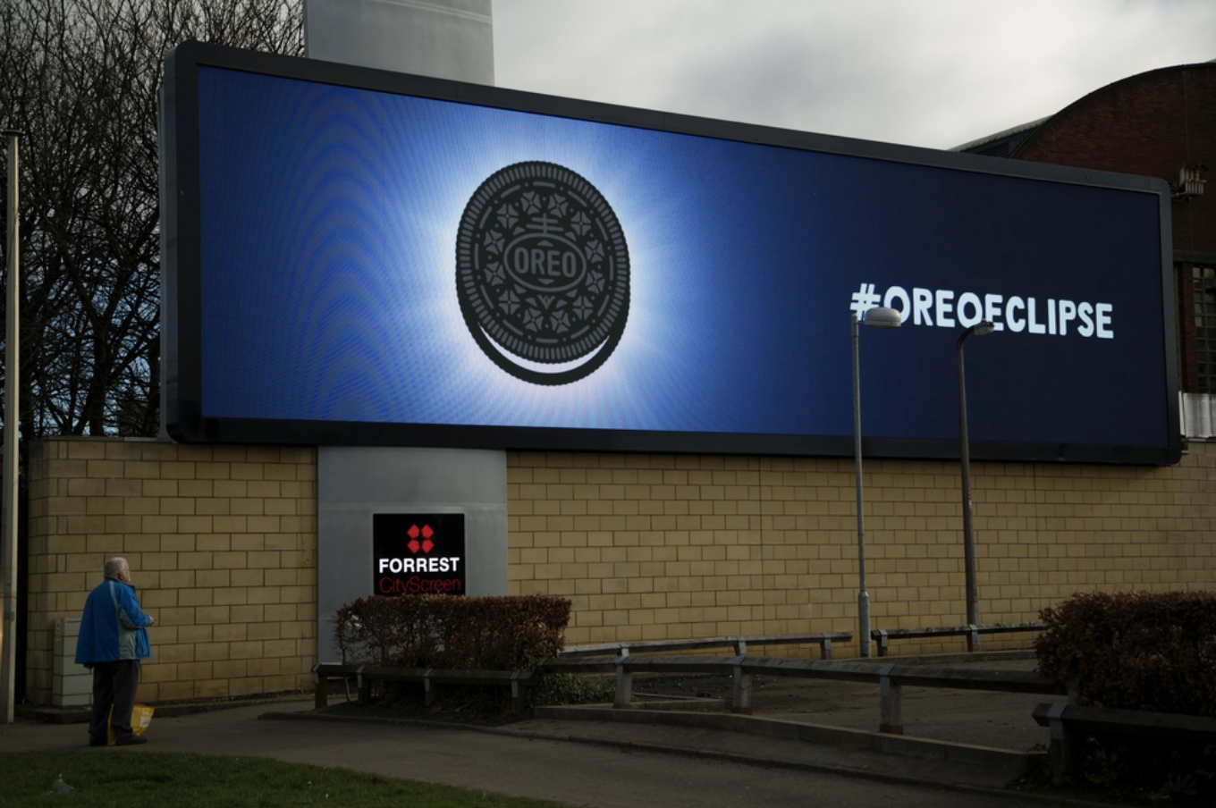
Talking about being appropriate and topical, have you seen this billboard from Oreo? This is one of the brands that have the best social media feeds when it comes to topical posts and physical ads as well. They took advantage of the eclipse and put themselves out there, so the audience wouldn’t forget that they can do anything while having an Oreo.
Be Entertaining
Have you ever thought of advertising as a form of entertainment? Well, Think about it now. Making TV ads for example follow the same process as making actual movies after all. And like I said earlier, you should try to make your audience smile so that they can remember you. Isn’t that what movies do as well? Advertising doesn’t have to be boring just because you’re selling something. You shouldn’t be too obvious about that anyway, so be as subtle as possible. And entertain your audience while you’re at it. Let’s take a look at a few examples of advertisers being kings of entertainment.
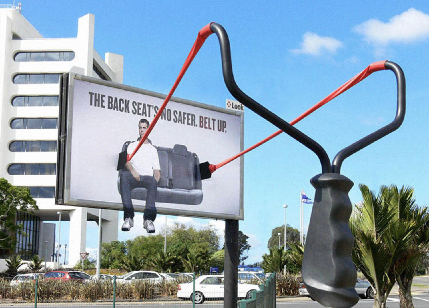
There are many ways of insuring that people are safe in their car rides, and Clemenger BBDO found a very creative way of communicating it. It is creative, funny and simple enough for anyone to understand.
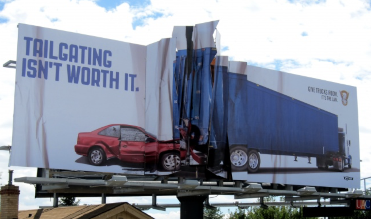
Still on the safety side, Amélie Company made an ad for Colorado State Patrol communicating how dangerous tailgating can be. It’s not entertaining as in funny, but it’s still an interesting way of warning people about the dangers of bad road practices.
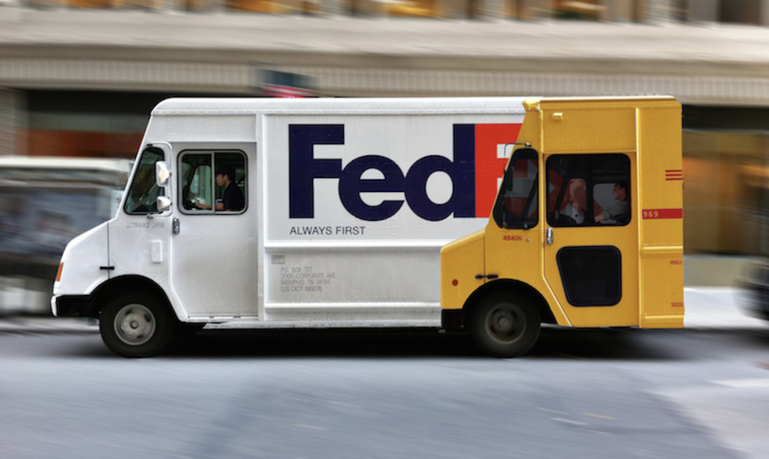
If you are the fastest delivery company, how do you prove it with truck advertising? Fedex found a way to show its customers just how far ahead they will always be with this ad by Miami Ad School Hamburg.
One For the Road
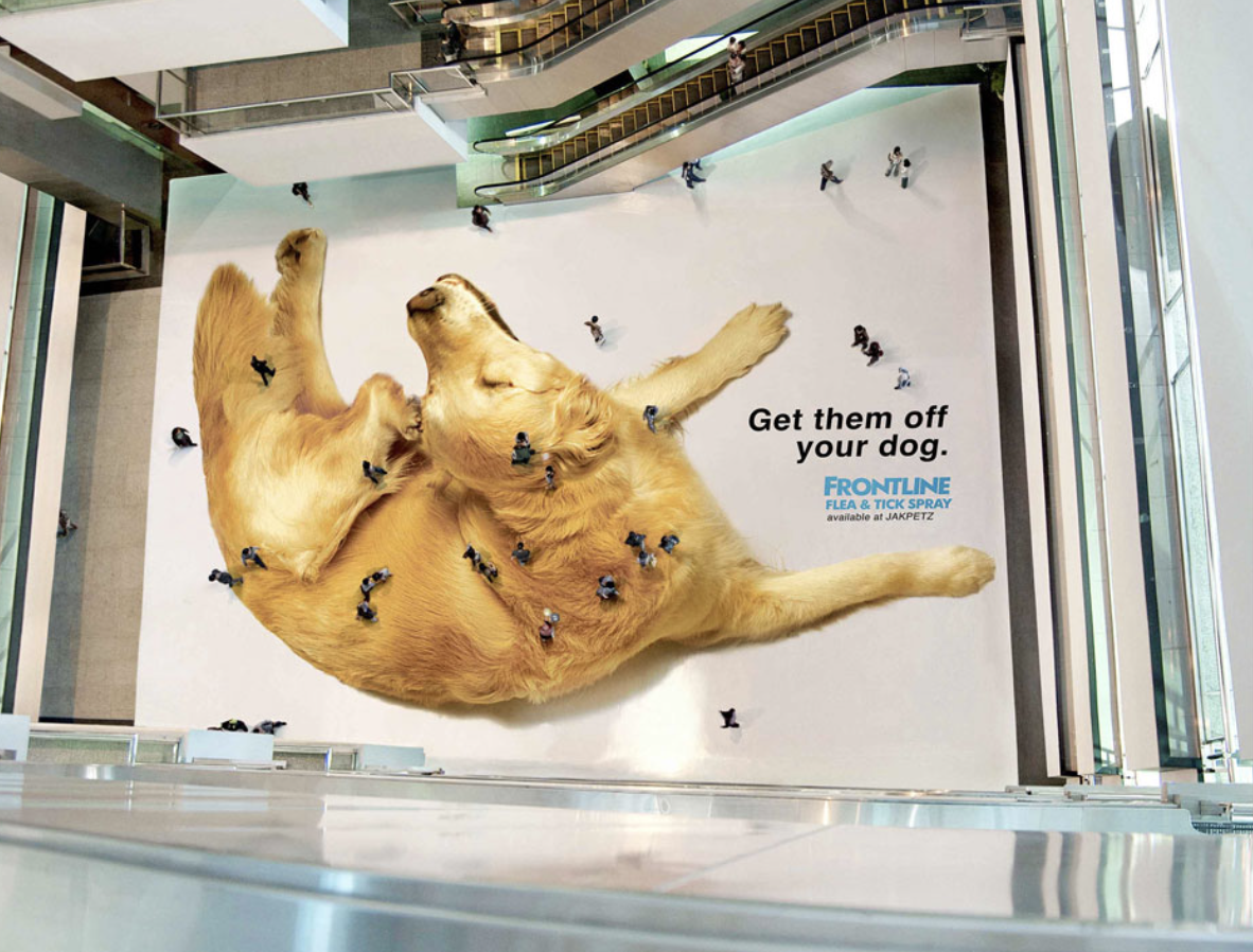
One last tip for you: check the competition. It can be helpful to watch the competition and see what they are doing. Or just for inspiration? It will allow you to explore your weaknesses and strengths as well as theirs. Maybe they make the best hot chocolate in town, but your cappuccino is way better than theirs. That can be a good foundation for a creative idea. And remember, you want to make as many impressions as possible so choose the locations wisely. You don’t want to waste all your effort on a billboard that will make only a handful of impressions per day. Of course with all that come the costs. You want the best creative results, so be prepared to spend accordingly. Lastly, consider your options in terms of OOH outlet. You have a choice to make between static and digital boards, car wraps, bus shelters, truckside advertising and even the floor of a mall. Anything that can make your ad pop and distract people from their routine is welcome. Thinking outside the box will also add originality to your brand personality.
References:
https://www.thedrum.com/news/2018/09/12/the-most-influential-out-home-campaigns-2018-so-far
http://adsarchive.com/light-bulb-billboard/
https://www.delnext.com/blog/en/creative-billboard-ads/
https://digitalsynopsis.com/advertising/creative-billboards-outdoor-ads/
https://www.targetmarketingmag.com/post/4-effective-outdoor-advertising-tips-from-the-pros/


