In the beginning, advertising was basic. It was about selling, letting people know about your product, how much it cost, and how to use it. Yes, it was that basic. But now, it has become more of an entertainment as advertisers work harder to deliver creative work. When it comes to outdoor advertising, creatives go all the way. By that, I mean they come up with the most surprising ideas and even go as far as to interact with the audience.
Now, interactive outdoor advertising has become a thing. Before we dig into the subject though, let’s take a look at the definition of the word interactive. According to the Cambridge English Dictionary, it’s an adjective that refers to the action of involving communication between people or reactions between things that work together. In our case, it’s advertising that involves communication or reaction between the outdoor ad and the audience. There are two categories of outdoor interactive advertising: non-digital and digital.
Non-Digital Interactive OOH
There are many types of non-digital interactive OOH, and we will be exploring the most interesting ones.
Ambient
Ambient advertising is about placing ads on unusual objects or at unexpected places to grab the attention of the audience. It sometimes gets interactive, especially when it is on-street furniture people can sit on or lean on. Let’s take a look at some great ambient interactive OOH.
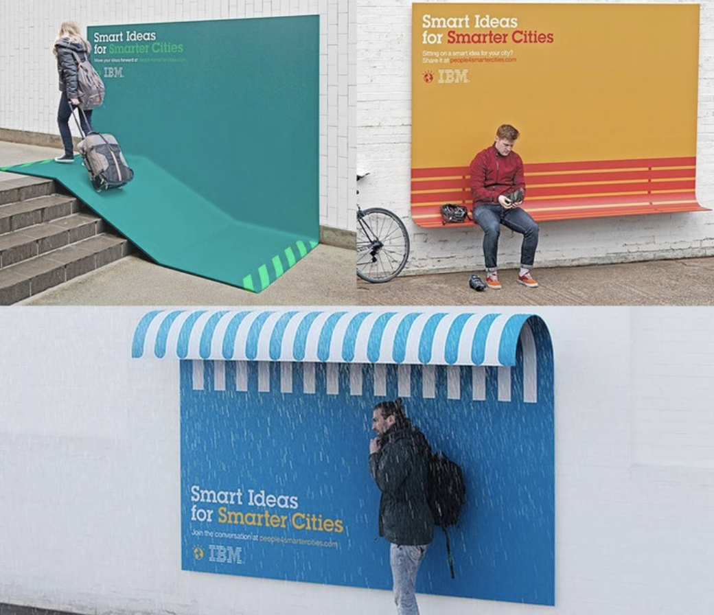
The first one is the IBM “Smart Ideas for Smarter Cities” campaign. With this campaign, the brand was trying to promote fostering smart ideas by proceeding another way. Instead of just making billboards with lever lines, they chose to demonstrate what they mean by smart ideas. They installed functional designs with which people could interact in a practical way.

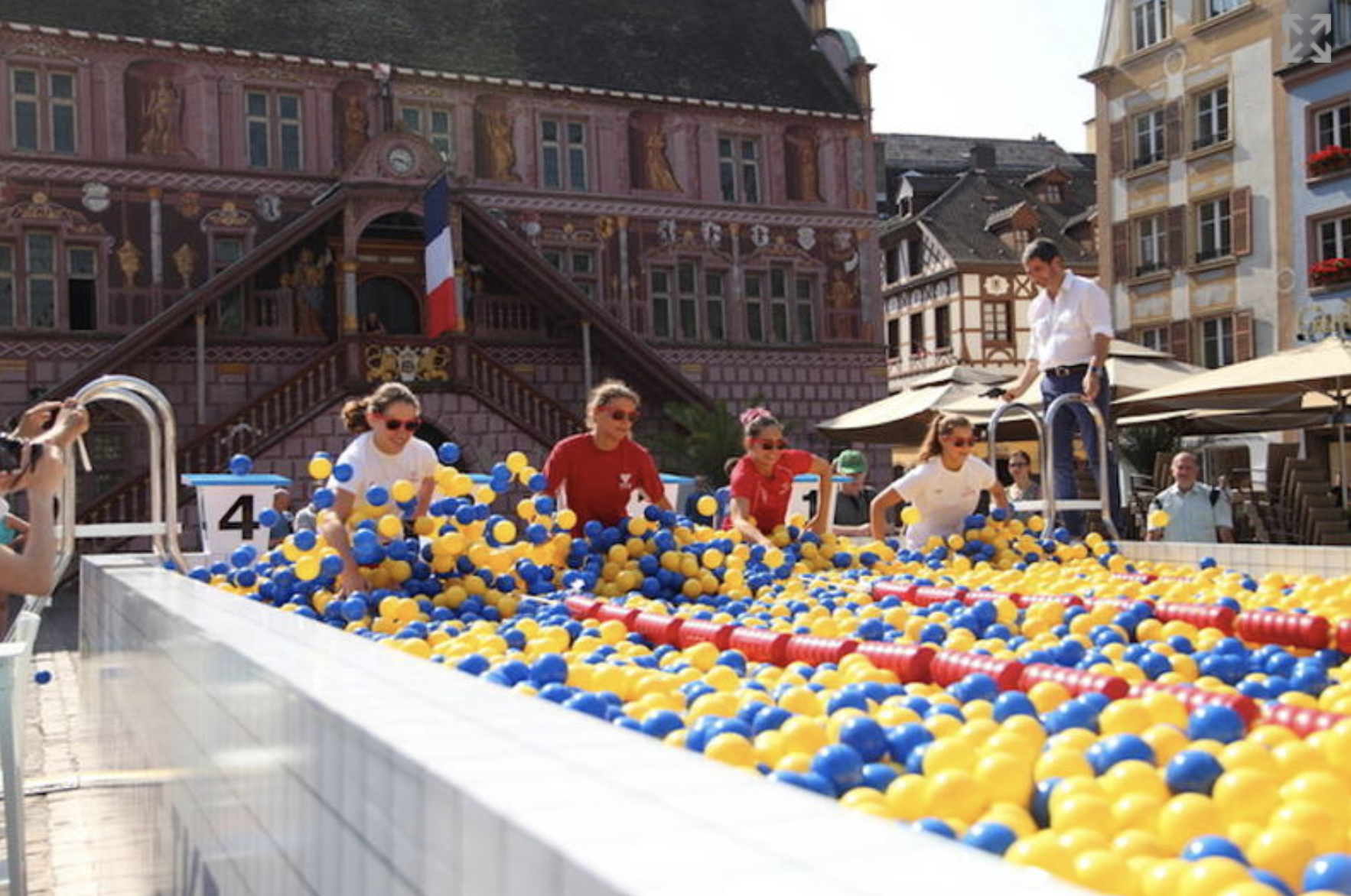
Another example of creative interactive ambient is IKEA’s ball pool interactive advertsing. To celebrate the opening of their new store in Mulhouse, France, IKEA built a giant ball pool in the colors of the brand, located in the Town square of the city. It was also to pay homage to the town’s Olympic swimmers. Seven athletes of the Mulhouse Olympic Natation Club participated in the event held for the occasion and competed against each other in the ball pool. Residents were welcome to live in and enjoy the pool as well.
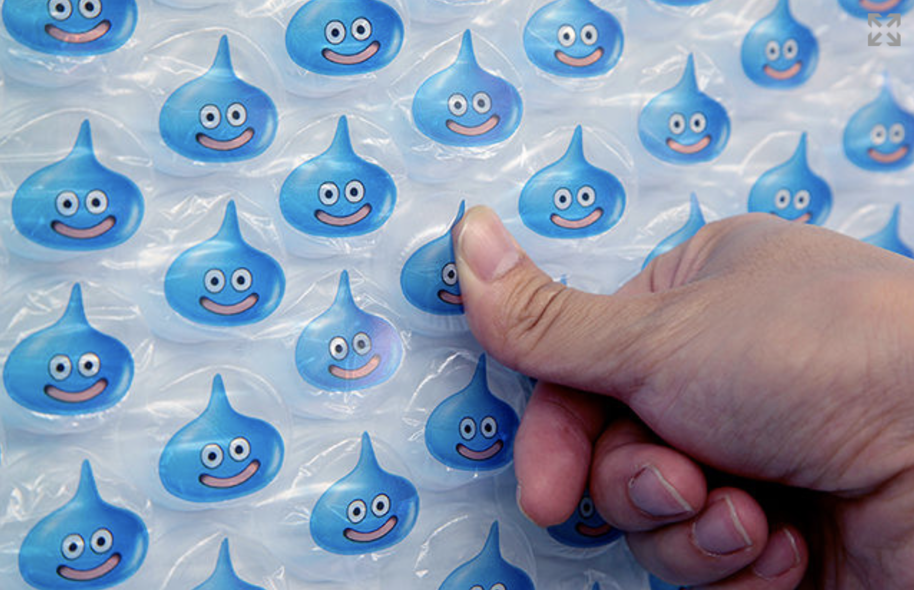
Let’s look at one more before moving on, the Dragon Qu’est video game’s bubble-popping promotion. For the promotion of the game, advertisers put installer an interactive wall of Bubble wrap in one of Tokyo’s busiest subway stations. It turned out to be very effective, because it drew in commuters of all ages, turning their usually boring wait for the train into an epic bubble-popping battle. It wasn’t the kind of battle that pit people against each other. Instead, the 100,000 slimes battle in Shinjuku challenged people to work together. The prizes were given away online to the gamers when all of the bubbles had been popped.
Product Dispensers
These are just like ambients, the audience interacts with the ad and receives physical rewards for it. You can call it a more sophisticated way to sample the product. It’s a rather clever technique; the other has been overused. By the other, I mean having sales representative stand in the streets trying to convince people of the benefits of their products. Why not let them get curious and see for themselves?
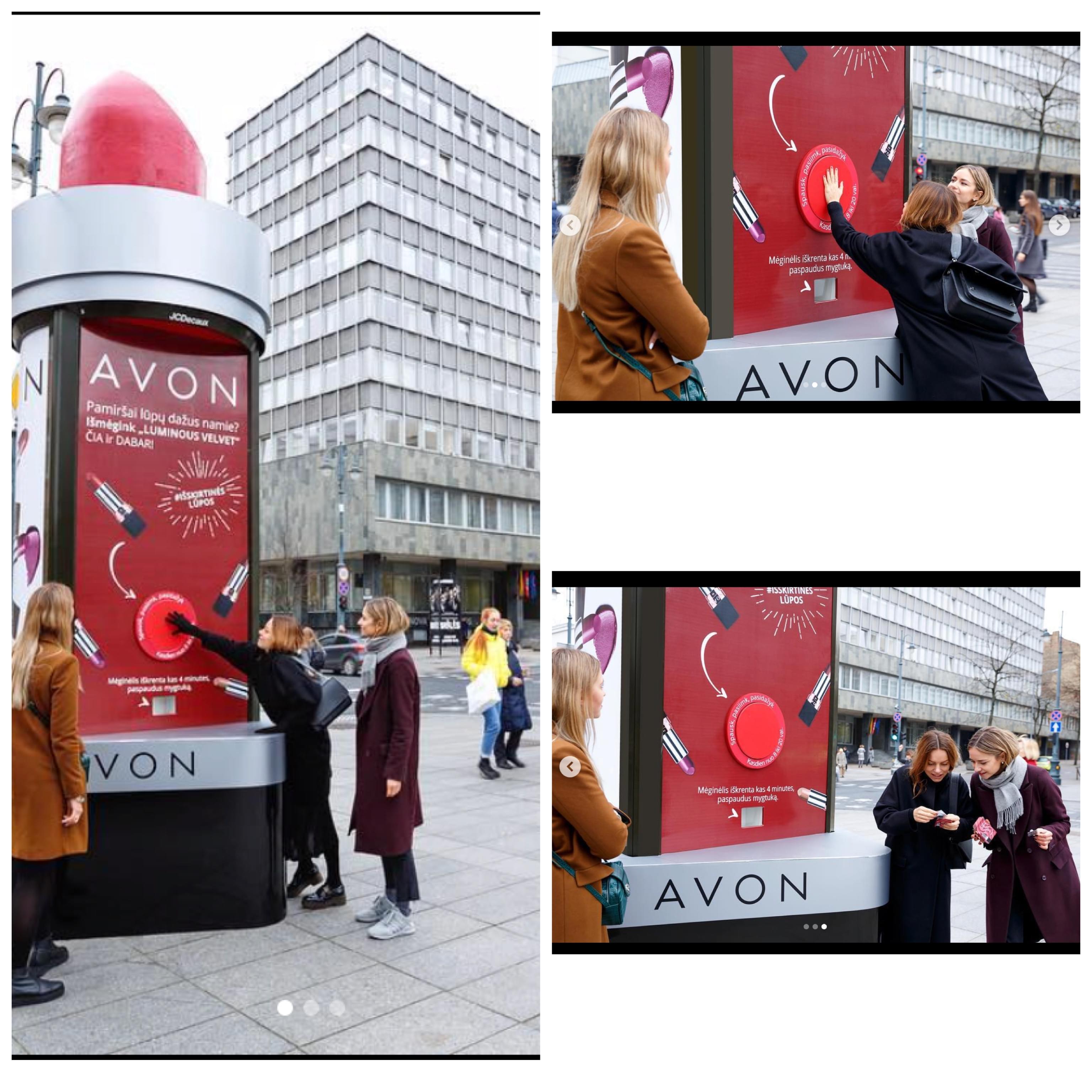
The first example I thought of is actually one of my favorites. Avon installed giant lipsticks in the city of Vilnius, and customers were supposed to press a button to Receive free lipsticks. What better way to make people remember your brand? They get to simple it without anyone pestering them about its benefits. They can make their conclusion after testing it. And let’s be honest, who doesn’t like free stuff?
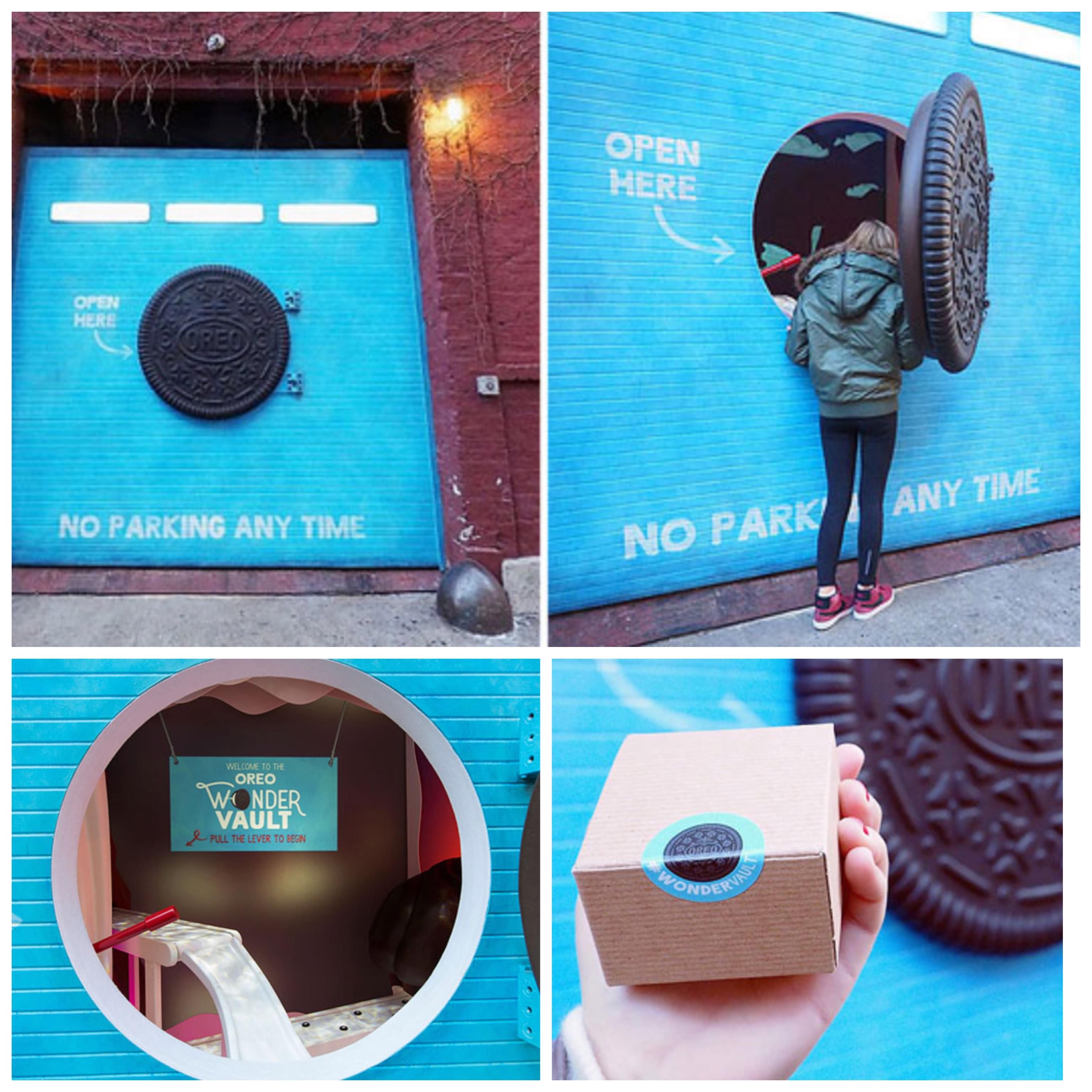
The second example of interactive OOH I want to to talk about is the Oreo Wonder Vault pop-up in New York City. The brand installed a room to which the public had access by opening an Oreo looking door. After opening the door, you pull the red handle, activating the Vaud. A box filled with Oreo cookies then travels directly to you, and here you have your free fin of Oreos! Again, who would say no to free food?
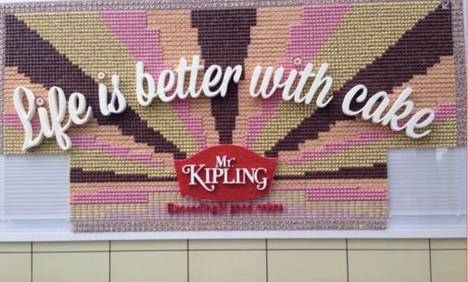
The third example is another one of my favorites: the sweet interactive billboard. For its campaign “Life is Better with Cake,” Mr. Kipling set up a giant billboard ad in London, made mostly of cake. The billboard was perfect for making a statement, a tasty one at that. It looked like a mosaic with lots of colorful cake squares. But he had to find a way to inform the audience about it so that the delicious cakes don’t go to waste, so he turned to social media. The company sent out tweets to alert cake lovers that they can stop by and grab a bite. The billboard was taken apart piece by piece as the squares of cake were handed out to hungry Londoners.
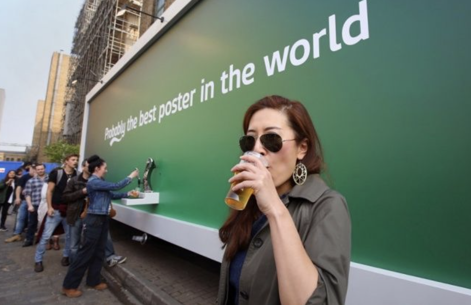
And lastly, perhaps everyone’s favourite except me, since I don’t consume alcool: the beer dispensing billboard— another Londonian brilliant interactive advertisement made by Carlsberg this time. The billboard was equipped with a tap through which the public could get a cup of fresh beer for free. However, people could get only one cup each, for obvious reasons. Also, the brand hired a guard dressed as a civilian to make sure that everything went smoothly. This was a smart way of making people crave their product and come back for more, or in this case, buy for more. Well done, Carlsberg!
Packaging
A lot of brands have personalized packaging, making them recognizable everywhere. However, some thought that it would be a great idea to use their packaging as an advertising tool, and they were right. I mean, advertisers have an unlimited creativity supply up their sleeves, and we will never have enough of it, either. Now, let me introduce to you another form of interactive OOH: packaging advertising.
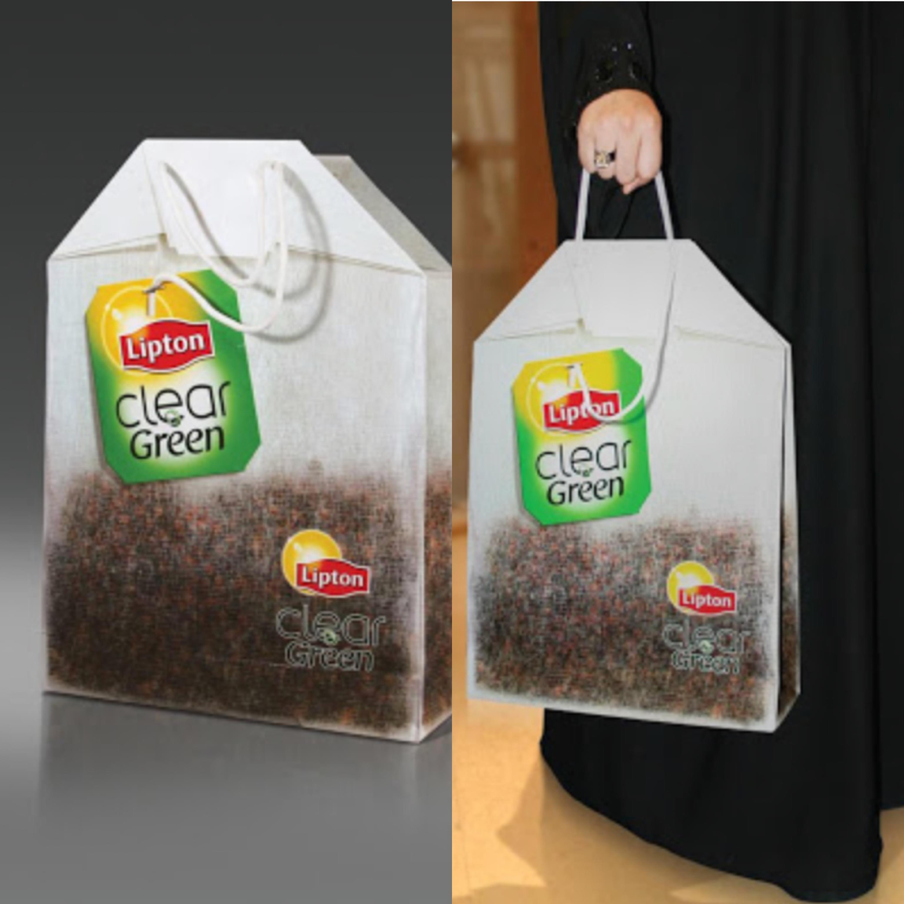
Examples are better than detailed explanations, so here is the first one I’ll show you. Lipton had the brilliant idea of designing their shopping bags to look like their actual clear green tea bag. I don’t know how you guys feel about this, but I’m suddenly craving some Lipton tea. Something tells me that was their goal all along.
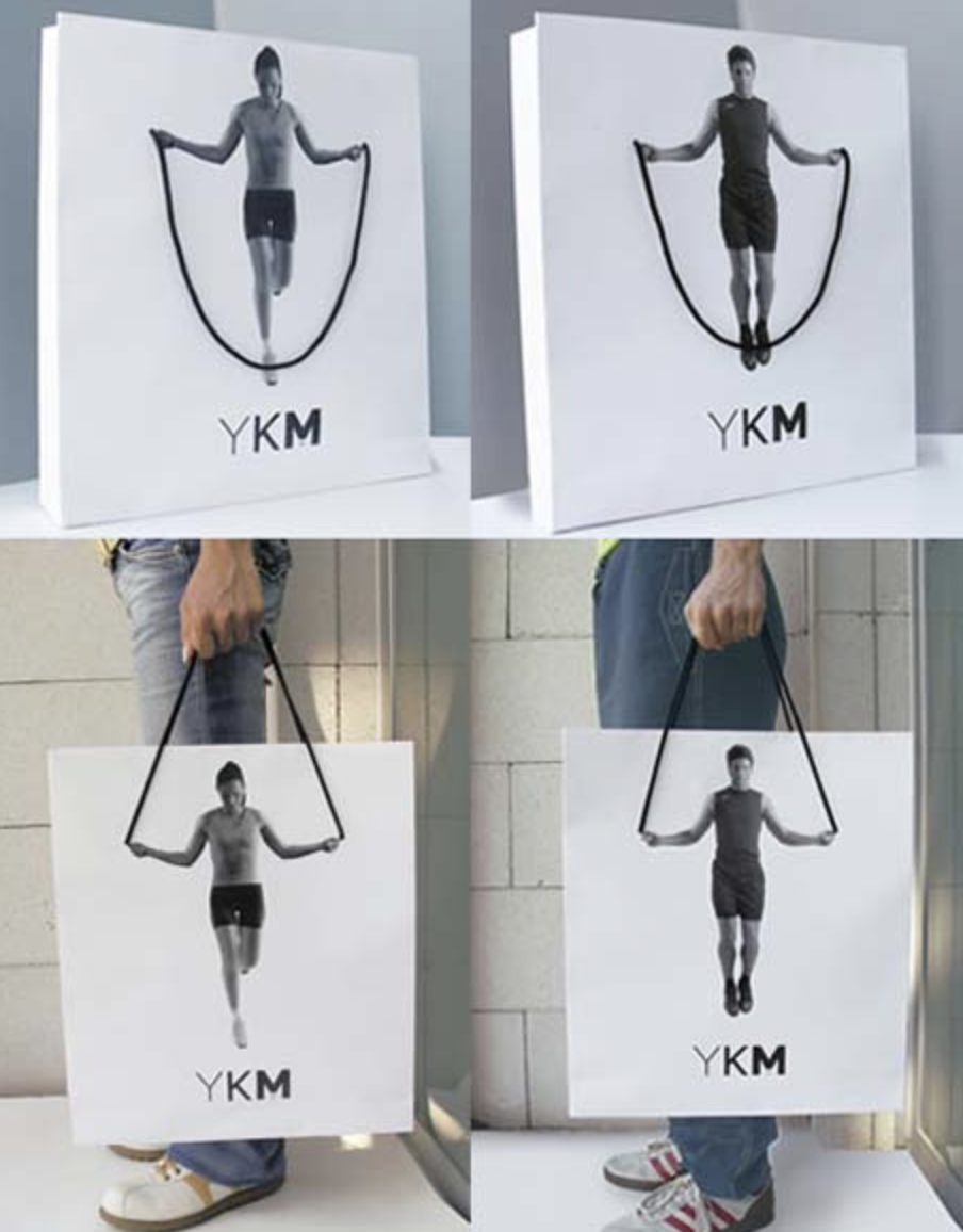
The second example I picked is by YKM Istanbul. They made shopping bags with pictures of a person about to jump the rope, which was represented by the bag handle. When the customer is walking around holding the bad, it looks like the person in the picture is jumping the rope. A fun way of inviting you to exercise wearing their sports clothes, don’t you think?
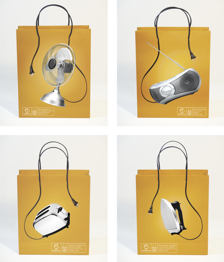
For its campaign “unplug to save,” the Filipino company, Meralco, made shopping bags picturing many home appliances unplugged. The handle of the bag played the role of the cable of the appliance pictured on the bag. The bags were given away during Christmas and also contained tips on how to save electricity and how to practice smart electrical consumption.
Digital Interactive OOH
nteractive Digital OOH or interactive DOOH is the improved version of digital OOH because it’s better in every way. It’s impressive, for one thing. I mean, who needs TV when you have augmented reality ads at the bus stop? Who needs regular digital billboards when their billboards out there with advertisements directed specifically at each individual? See what I’m getting at? Yes, interactive DOOH is the holy grail of advertising right now. Okay, maybe I’m exaggerating on this one, but keep reading to find out if that’s the case.
Just like non-digital interactive outdoor advertising, there are a few different types of interactive digital outdoor advertising as well. But in this post, we will be focusing on the following two.
Augmented Reality
Augmented Reality or AR integrates the physical, real-world environment with computer-generated digital content such as sound, video, or graphics. It’s been around for a while now, and advertisers are using it more and more. But they aren’t the only ones who enjoy it. Consumers love it too because not only is it interactive, but it’s entertaining as well.
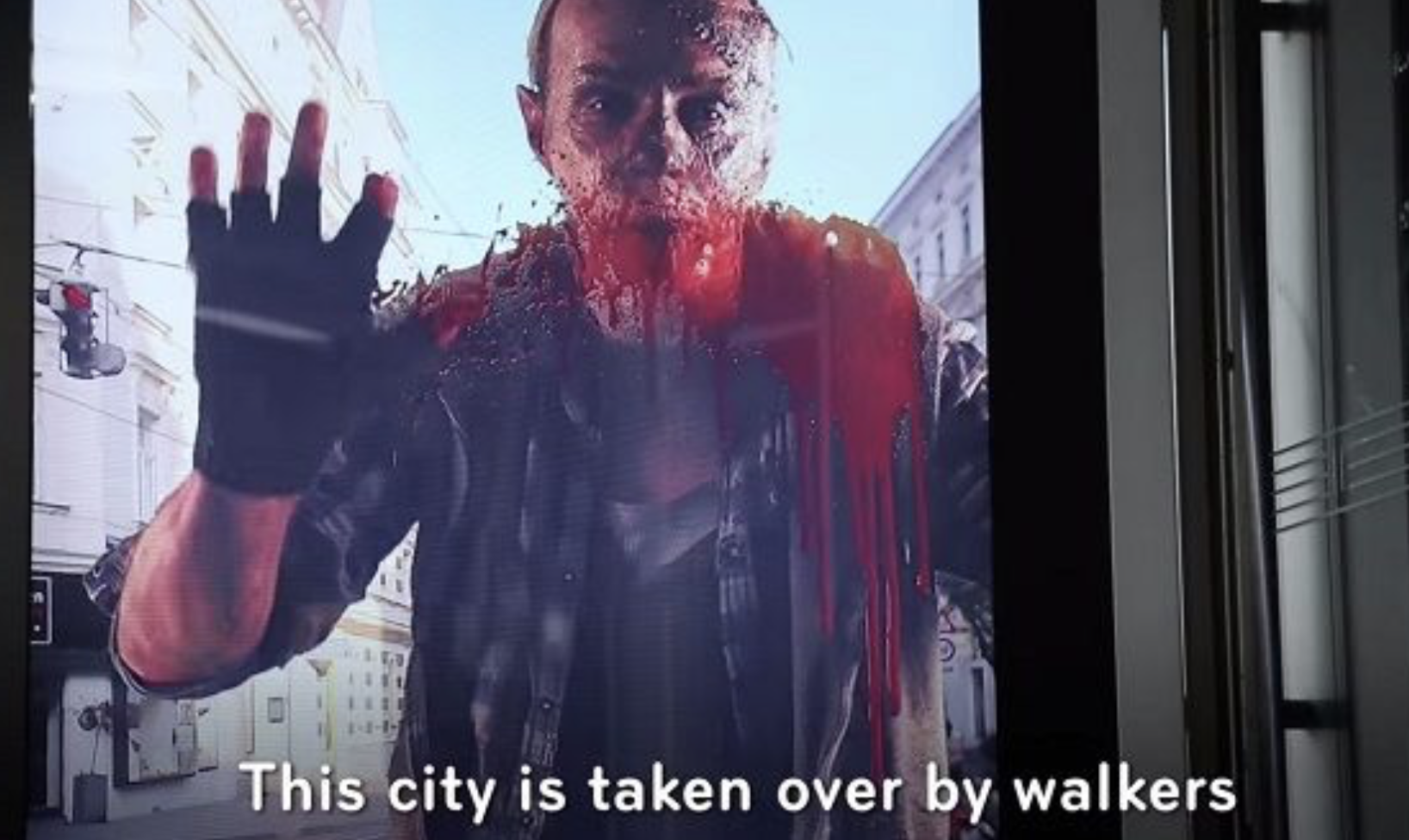
The first augmented reality I came across was the terrifying billboard made for the promotion of The Walking Dead’s new season. It was installed at a bus stop, in Vienna, Austria. The digital billboard made it look like the zombies appeared in real life, as they materialized out of nowhere. The background was similar to the street behind the billboard, so it terrifies a few bystanders. A good way to spike the audience’s adrenaline level, if you ask me. You can check out the interactive advertsingvideo here.
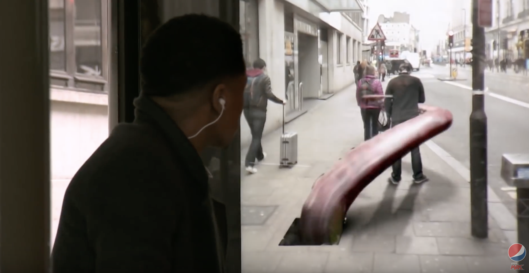
Another ad made impressive by augmented reality is the one made by Pepsi for its Pepsi MAX campaign, in London. They made people believe that they were watching some horrifying events happening through the bus shelter’s glass. But, in reality, they were just watching a video. It looked so real that it generated some interesting reactions among the public. The ad even won some awards. You can see the whole interactive advertising video here.
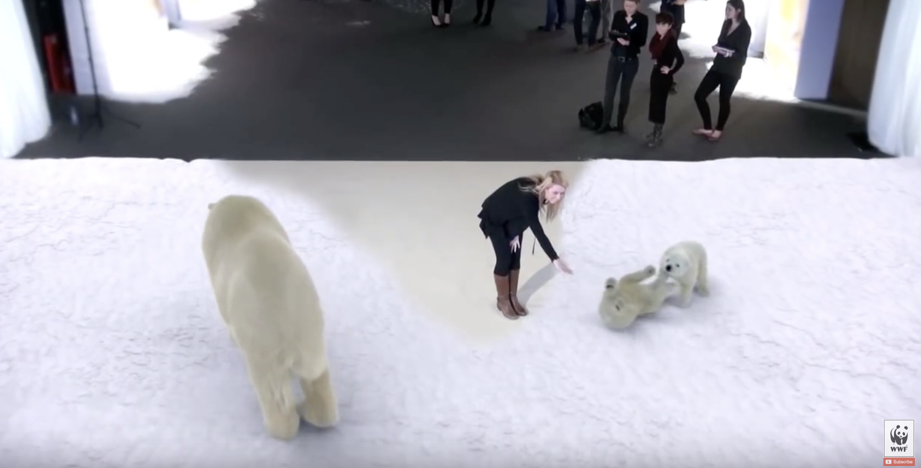
Lastly, Coca-Cola partnered with WWF to raise awareness and funds for the conservation of the Arctic, home of polar bears. They pulled an augmented reality stunt in the London Science Museum, making it look like the audience was close to a polar bear family. The goal was to create an emotional connection between visitors and the polar bears family, and they succeeded. You can see the video of some of the interactions here.
Recognition Technology
It’s simple. It’s a billboard ad that changes content depending on what is going on around it. It can be someone responding to the ad on their phone, someone looking at the billboard or someone smoking in front of the billboard. You name it. The technology is behind those billboards is truly fascinating. You’ll see what I mean after checking the following examples.
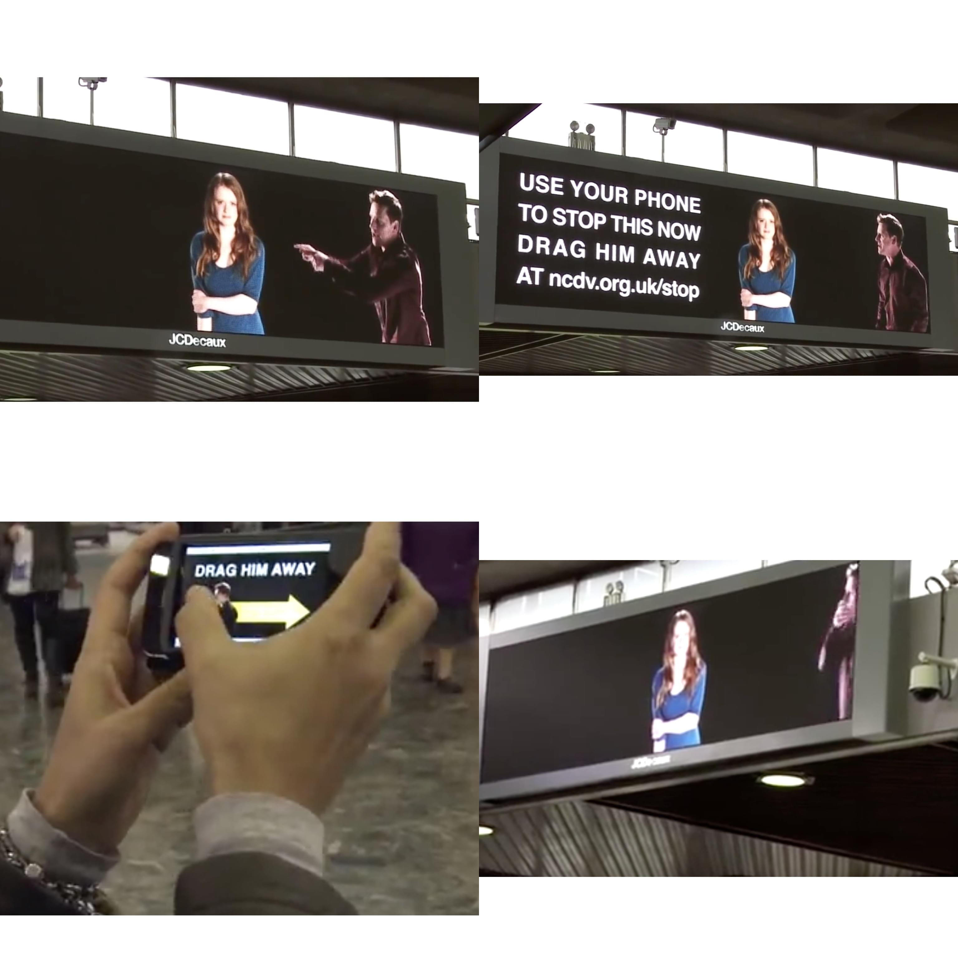
For its campaign against domestic violence, NCDV’s used a few digital billboards in Euston Station, in London, featuring an ad of a man screaming at a woman. There was a call to action, telling the audience to log on to NCDV’S website to virtually ‘drag’ the man away. While doing so, they could see him being dragged away in real-time on the billboards. You can see the whole video of the interactive digital billboard here.
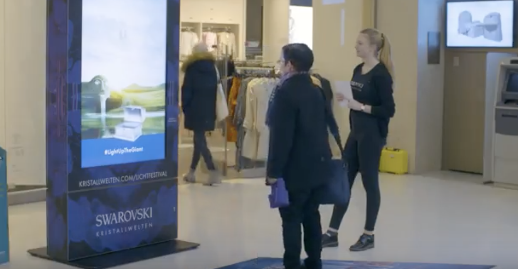
Swarovski also used an interactive digital billboard ad ad for one of their campaigns. The billboard used motion and gesture trackers to turn the audience into the characters of an interactive game. As the player moved, so did the trunk, which was supposed to catch as many gems as possible. You can watch the video of the interactive ad here.
References:
https://economictimes.indiatimes.com/definition/ambient-advertising
https://catchoom.com/blog/15-cool-augmented-reality-advertising-campaigns/
https://www.jcdecaux.com/blog/virtual-and-augmented-reality-ooh-creating-authentic-experiences
https://www.trendhunter.com/trends/digital-billboard
https://www.movingwalls.com/blog/interactive-billboards-the-future-of-dooh-advertising
https://broadsign.com/blog/interactive-digital-signage/


