The world is filled with advertisements and the advertising world is filled with so many pieces of work that a lot of it isn’t even seen by the public. However, that doesn’t mean everything we see on a daily basis is really worthy of our attention. We’ve got ads on tv, on social media, in our emails, on websites, in magazines and in basically every other place imaginable. However, even with all these other forms of advertising, it’s hard to dispute the fact that nothing is really as attention-grabbing as the billboard.
In this post you’ll learn a bit about billboard history, find out why and how they continue to work, and discover some of the common elements that are seen across the majority of billboards. You’ll also be taken through eight of the best out-of-home advertisements Canada had to offer in 2019 and unpack what it was exactly about each that made them so successful.
A brief history of billboards
The origins of billboard advertising dates back to the 1830s. At this time there were no leasing agreements with media companies. Instead, posters were glued or painted on walls and fences. The first large format poster recorded was in 1835 “in New York when Jared Bell began printing circus posters.” Throughout the 1800s billboards started to be seen more frequently and by the year 1900, billboard standardization came into place and from there grew the modern day version of outdoor advertising.
Today there are over 340,000 billboards in the United States alone, with a year-over-year growth of roughly 700. While it can be argued that these numbers are not all that substantial because they’ve taken 190 years to become this way, the fact remains that the billboard industry has been around for almost two centuries and continues to prosper. This alone points to the fact that billboards are a useful marketing tool that will continue to be utilized by brands even with the rise of technology-based forms of promotion.
Why does billboard advertising work?
For starters, billboards are massive. In North America they generally range from as small as 14’ x 48’ to being as colossal as 16’ x 60’. One of the main things that differentiates out-of-home from other advertising forms is their eye-catching designs. Billboards utilize jarring and bizarre visuals, they can have added sections to create larger more elaborate designs, and some even have things popping out of them that produce three-dimensional effects.
While almost every billboard employs a similar strategy of using these unique visuals, they also tend to keep the number of words to a bare minimum. Most billboards you see will likely contain no more than seven words. This is because readability of an ad is key. Billboards are seen from a distance and usually from a moving vehicle, meaning that the viewer generally has only six seconds to take in all the information. This is because the human brain can only process so many words at a time – and it has to do so while also digesting the billboard’s other elements – it’s better to keep words sparse.
Canada’s Top Eight
The following list are eight of the best billboard and out-of-home advertisements that were put to market in Canada during 2019. Some feature clever headlines, while others are praised for their innovative designs. Regardless, each takes a unique approach to showcase and connect their brand or product to the viewer.
1. PinkCherry
This billboard for PinkCherry done by Toronto agency The Garden, is widely considered to be the best 2019 Canadian billboard by a variety of sources. The ad is very simple and features only a white background with copy on the left side and an image of a pink sex toy on the right. While there is nothing spectacular about the design of this billboard, it is the copy, which reads, “Scream your own name” that really brings the ad to life.
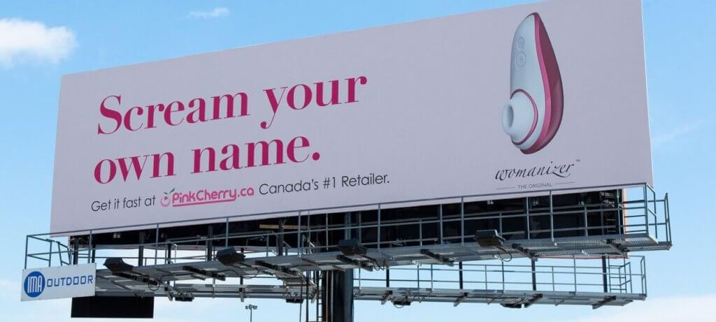
Billboards of a sexual nature tend to be nixed by the media companies who own these spaces. Yet, this one managed to claim itself a spot along the QEW at the 427, one of the busiest locations in the city. The main reason for this is that while it is at its heart a billboard about sexual self-fulfillment, it can also be viewed as a message of female empowerment. This connection to the viewer and to a hot button topic in mainstream society make this billboard one the best of 2019.
2. No Name
Unless you were living under a rock in 2019, if you were in Toronto you know about this no name campaign. It was created by Toronto agencies john st. and Dentsu and spanned across many advertising forms such as television commercials, social media posts, and in multiple real-world spaces through the use of OOH advertising. These ads flooded the city and while there wasn’t a standard billboard for this campaign, no name utilized the sides of buildings and even the GO train to increase viewer reach.
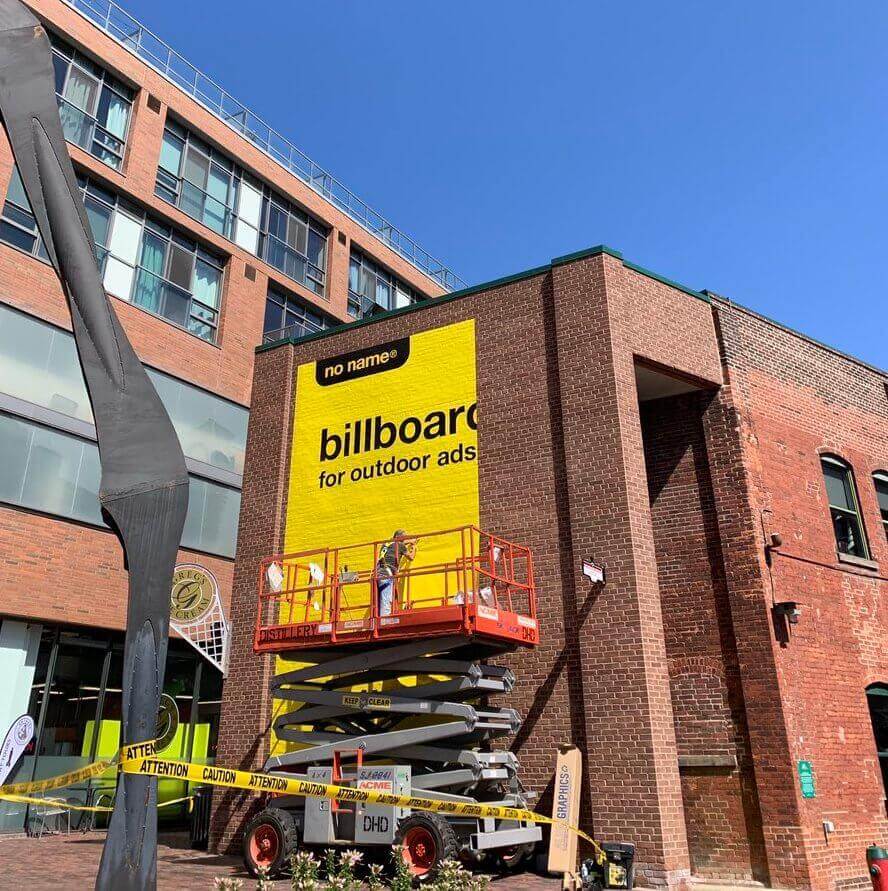
The primary reason for the success of this campaign is because of how true to the brand the ads were and how well they all connected to each other. Every ad contained a yellow background, black font and simply labeled whatever object the ad was on. Essentially, the ads matched the packaging of the no name products. The simplicity of the idea made it easy for viewers to understand what they were looking at which allowed everyone to be in on the joke.
3. The Société de l’assurance automobile du Québec
The Société de l’assurance automobile du Québec (SAAQ) paired up with Montréal-based agency Lg2 to show pedestrians the dangers of jaywalking. To do so they turned a bus shelter into an interactive billboard that created an x-ray of passerby’s bodies. People stopped in front of this, moved their body parts and watched as the skeletal version of themselves did the same. It all seemed like a lot of fun until a few seconds later when a digital car zoomed across the screen, sending their digital skeleton flying. This was followed by the copy, “Bone vs. Steel, you have no chance.”

The reason for the success of this OOH advertisement is the way it brought the problem to light for the viewer. Jaywalkers forget about the risks of doing so for the sake of getting to their destination faster. By showing them the potential outcome of their decision, SAAQ and Lg2 created a horrific experience that was sure to make people think twice about jaywalking in the future.
4. KitchenAid
Using the creative prowess of Toronto agency Zulu Alpha Kilo, KitchenAid created a digital billboard that was synched with the CN Tower. Everyone who lives in Toronto is well aware that the CN Tower changes to a variety of colours at night. It can even be seen matching it’s colours to specific events such as Pride or holidays like Valentine’s Day. The CN Tower is a staple of Toronto, but few brands use it to their advantage. But KitchenAid did just that when they used the CN Tower to create a connection between their product and the city.
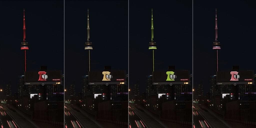
KitchenAid appliances are known to come in bright colours, so theycreated a billboard with a black background and gigantic light-up stand mixer and placed it along Gardiner Expressway. During the day it looked like nothing but a giant mixer. However, at night it had a surprise in store for viewers. Using sensors that auto-detected the CN Tower’s colour, the stand mixer’s colours were synched to match it. This created a real-time effect of the mixer and CN Tower being linked and placed KitchenAid’s products positively in the minds of consumers.
5. HSBC
During the summer of 2019, HSBC, with the help of Wunderman Thompson, ran a campaign called “Adpointment.” The purpose of these billboards was to show people how HSBC offers a personalized experience that adapts to each bank patron’s needs. To do this they turned billboards into branches and invited passersby to go up into these “new branches” and speak with an HSBC representative.
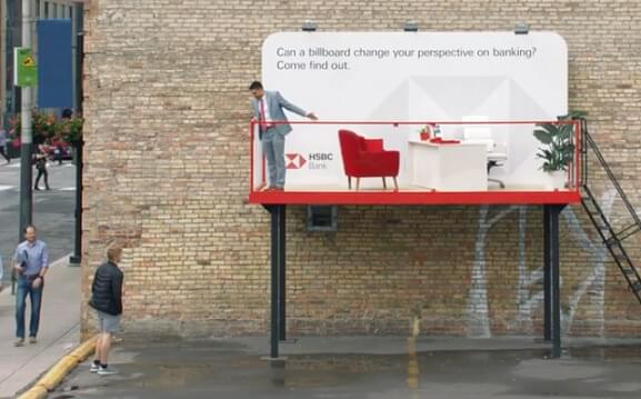
The billboards themselves were simple, having only, “Can a billboard change your perspective on banking? Come find out” as copy. However, the construction around the billboards were much more complex. Each looked as if it were a real HSBC office, complete with two chairs and a desk. The office spaces even contained less functional elements like a lamp and a plant to make them feel more realistic and inviting.
The reason these ads worked so well is because HSBC kept true to their idea of personalization and brought the bank to their target audience. By turning the billboards into a physical experience rather than just words and imagery on a canvas, the brand showed that they really are innovative and can make anything possible for their patrons.
6. Tim Hortons
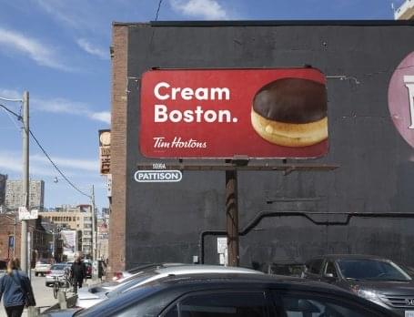
With their agency of record, Zulu Alpha Kilo, Tim Hortons used a billboard at exactly the right moment to reaffirm their connection to hockey. As their namesake suggests, the association between Tim Hortons and the Toronto Maple Leafs is deep-rooted. So, during the 2019 NHL playoffs when the matchup between the Leafs and their long-time rivals, the Boston Bruins was set to commence, Tim Hortons created a billboard that could be considered a call to arms for Toronto hockey fans.
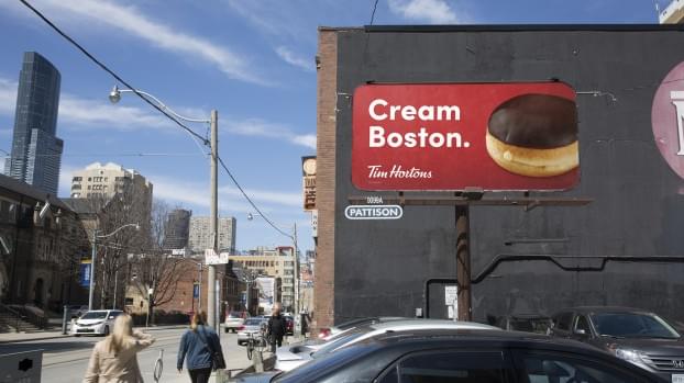
The billboard used the Tim Hortons’ classic red as the background and placed an image of a Boston cream donut on the right hand side. What made this billboard so great was its use of copy. On the left side the Zulu Alpha Kilo took the doughnut’s name and flipped it to read, “Cream Boston.” These two words were so simple that even people who wouldn’t consider themselves huge hockey fans could understand their meaning. Thus, the ad created a playful rallying cry and reasserted the connection between Tim Hortons and hockey lovers.
7. Wunder
At the tail end of 2019, Halifax-based agency, Wunder used billboards, bus shelters, social media, and newspapers to send their own message to consumers. Instead of filling the space with messaging from one of their clients, Wunder launched their own campaign called White Christmas. They paid $10,000 and filled the media spaces with blank white imagery. Their reasoning for doing so was to give viewers a break from all the holiday advertising that is typically seen throughout the month of December.
8. Peoples Jewellers
For their 100th Valentine’s Day in business, Peoples Jewellers and their agency of record, Juliet Creative used billboards in a very different way from what is typical. To start, Peoples took over a 188-foot billboard located at Yonge and Dundas Square, one the longest in Toronto, but instead of running their own ads about their selection of jewelry, they selected four Canadians to write personalized messages to a loved one. These messages were about the love shared by the couples and they were brought to the square to see their message live and in person.
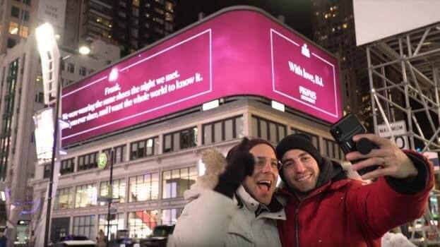
The messages were put on display not only for the couples to see, but also for roughly 150,000 daily viewers as well. Peoples also provided the couples with a piece of jewelry to help commemorate the moment. Using a billboard in this way was highly unorthodox, however it worked very well for Peoples because of the way it relates to their brand. Peoples has long been about the connections humans share with one another and by using their resources in this way they were able to strengthen these bonds for the four lucky couples involved.
Conclusion
This list is by no means comprehensive or conclusive, and there are plenty of brilliant and unique pieces of work put out by a variety of brands every year. Whether you agree or disagree that these are the best pieces to come out of Canada in 2019, it is clear that there are many similarities between them. Each of the brands on this list used their billboards in different ways. Some, such as PinkCherry and Tim Hortons focused on smart headline driven campaigns. Others, like HSBC or KitchenAid, offered up head turning visual elements. Regardless, all of these billboards made this list because they stayed true to their brand and provided exemplary ads that connected the viewer to the product.